CSS

Introduction
Cascading Stylesheets (CSS) is a language used to lay out, format, and paint web pages and other media. It is one of the three main languages for building websites—the other two being HTML, used for structure, and JavaScript, used to specify behavior.
In last year’s inaugural Web Almanac, we looked at a variety of CSS metrics measured through 41 SQL queries over the HTTP Archive corpus, to assess the state of the technology in 2019. This year, we went a lot deeper, to measure not only how many pages use a given CSS feature, but also how they use it.
Overall, what we observed was a web in two different gears when it comes to CSS adoption. In our blog posts and Twitter bubbles, we tend to mostly discuss the newest and shiniest, however, there are still millions of sites using decade-old code. Things like vendor prefixes from a bygone era, proprietary IE filters, and floats for layout, in all their clearfix glory. But we also observed impressive adoption of many new features—even features that only got support across the board this very year, like min() and max(). However, there is generally an inverse correlation between how cool something is perceived to be and how much it is actually used; for example, cutting-edge Houdini features were practically nonexistent.
Similarly, in our conference talks, we often tend to focus on complicated, elaborate use cases that make heads explode and Twitter feeds fill with “CSS can do that?!”. However, it turns out most CSS usage in the wild is fairly simple. CSS Variables are mostly used as constants and rarely refer to other variables, calc() is mostly used with two terms, gradients mostly have two stops and so on.
The web is not a teenager anymore—it is now 30 years old and acts like it. It tends to favor stability over new bling and readability over complexity, occasional guilty pleasures aside.
Methodology
The HTTP Archive crawls millions of pages every month and runs them through a private instance of WebPageTest to store key information of every page. (You can learn more about this in our methodology).
For this year, we decided to involve the community in which metrics to study. We started with an app to propose metrics and vote on them. In the end, there were so many interesting metrics that we ended up including nearly all of them! We only excluded Font metrics, since there is a whole separate Fonts chapter and there was significant overlap.
The data in this chapter took 121 SQL queries to produce, totaling over 10K lines of SQL including 3K lines of JavaScript functions within the SQL. This makes it the largest chapter in the Web Almanac’s history.
A lot of engineering work went into making this scale of analysis feasible. Like last year, we put all CSS code through a CSS parser, and stored the Abstract Syntax Trees (AST) for all stylesheets in the corpus, resulting in a whopping 10 TB of data. This year, we also developed a library of helpers that operate on this AST, and a selector parser—both of which were also released as separate open source projects. Most metrics involved JavaScript to collect data from a single AST, and SQL to aggregate this data over the entire corpus. Curious how your own CSS does against our metrics? We made an online playground where you can try them out on your own sites.
For certain metrics, looking at the CSS AST was not enough. We wanted to look at SCSS wherever it was provided via sourcemaps as it shows us what developers need from CSS that is not yet possible, whereas studying CSS shows us what developers currently use that is. For that, we had to use a custom metric—JavaScript code that runs in the crawler when it visits a given page. We could not use a proper SCSS parser as that could slow down the crawl too much, so we had to resort to regular expressions (oh, the horror!). Despite the crude approach, we got a plethora of insights!
Custom metrics were also used for part of the custom properties analysis. While we can get a lot of information about custom property usage from the stylesheets alone, we cannot build a dependency graph without being able to look at the DOM tree for context, as custom properties are inherited. Looking at the computed style of the DOM nodes also gives us information like what kinds of elements each property is applied to, and which of them are registered—information that we also cannot get from the stylesheets.
Usage
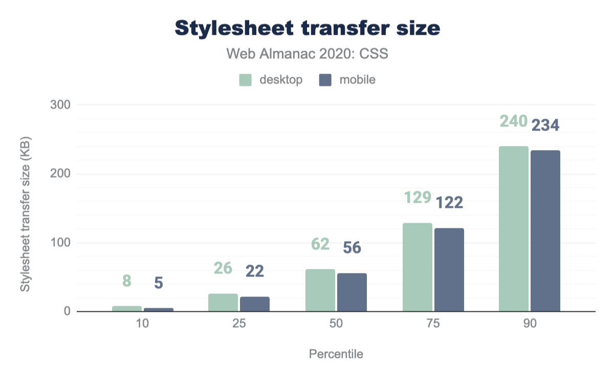
While JavaScript far surpasses CSS in its share of page weight, CSS has certainly grown in size over the years, with the median desktop page loading 62 KB of CSS code, and one in ten pages loading more than 240 KB of CSS code. Mobile pages do use slightly less CSS code across all percentiles, but only by 4 to 7 KB. While this is definitely greater than previous years, it doesn’t come close to JavaScript’s whopping median of 444 KB and top 10% of 1.2 MB
It would be reasonable to assume that a lot of this CSS is generated via preprocessors or other build tools, however only about 15% included sourcemaps. It is unclear whether this says more about sourcemap adoption or build tool usage. Of those, the overwhelming majority (45%) came from other CSS files, indicating usage of build processes that operate on CSS files, such as minification, autoprefixer, and/or PostCSS. Sass was far more popular than Less (34% of stylesheets with sourcemaps vs 21%), with SCSS being the more popular dialect (33% for .scss vs 1% for .sass).
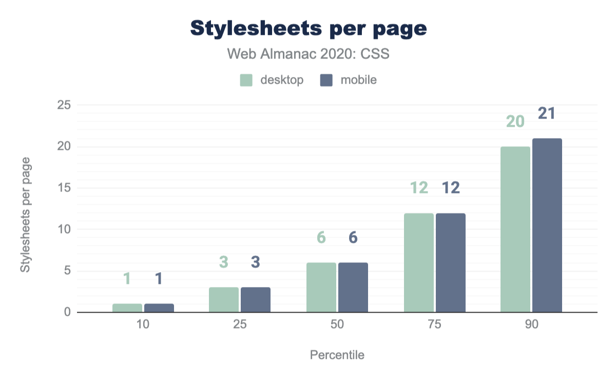
All these kilobytes of code are typically distributed across multiple files and <style> elements; only about 7% of pages concentrate all their CSS code in one remote stylesheet, as we are often taught to do. In fact, the median page contains 3 <style> elements and 6 remote stylesheets, with 10% of them carrying over 14 <style> elements and over 20 remote CSS files! While this is suboptimal on desktop, it really kills performance on mobile, where round-trip latency is more important than raw download speed.
Shockingly, the maximum number of stylesheets per page is an incredible 26,777 <style> elements and 1,379 remote ones! I’d definitely want to avoid loading that page!
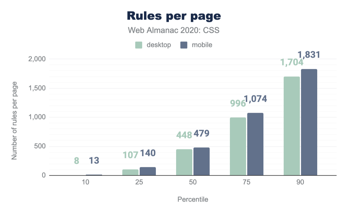
Another metric of size is the number of rules. The median page carries a total of 448 rules and 5,454 declarations. Interestingly, 10% of pages contain a tiny amount of CSS: fewer than 13 rules! Despite mobile having slightly smaller stylesheets, it also has slightly more rules, indicating smaller rules overall (as it tends to happen with media queries).
Selectors and the cascade
CSS offers a number of ways of apply styles to page, from classes, ids and using the all-important cascade to avoid duplicating styles. So how are developers applying their styling to their pages?
Class names
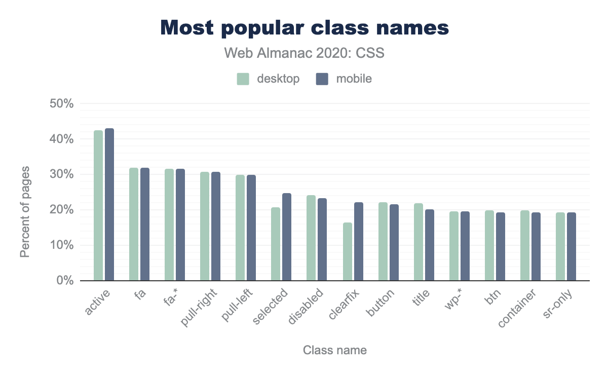
What do developers use class names for these days? To answer this question, we looked at the most popular class names. The list was dominated by Font Awesome classes, with 192 out of 198 being fa or fa-*! The only thing that initial exploration could tell us was that Font Awesome is exceedingly popular and is used by almost one third of websites!
However, once we collapsed fa-* and then wp-* classes (which come from WordPress, another exceedingly popular piece of software), we got more meaningful results. Omitting these, state-related classes seem to be most popular, with .active occurring in nearly half of websites, and .selected and .disabled following soon after.
Only a few of the top classes were presentational, with most of those being either alignment related (pull-right and pull-left from older Bootstrap, alignright, alignleft etc.) or clearfix—which still occurs in 22% of websites, despite floats being superseded as a layout method by the more modern Grid and Flexbox modules.
fa, fa-*;, pull-right, pull-left, selected, disabled, clearfix, button, title, wp-*;, btn, container, and sr-only.IDs
Despite IDs being discouraged these days in some circles due to their much higher specificity, most websites still use them, albeit sparingly. Fewer than half of pages used more than one ID in any of their selectors (had a max specificity of (1,x,y) or less) and nearly all had a median specificity that did not include IDs (0,x,y). See the selectors specification for more details calculating specificity and this (a,b,c) notation.
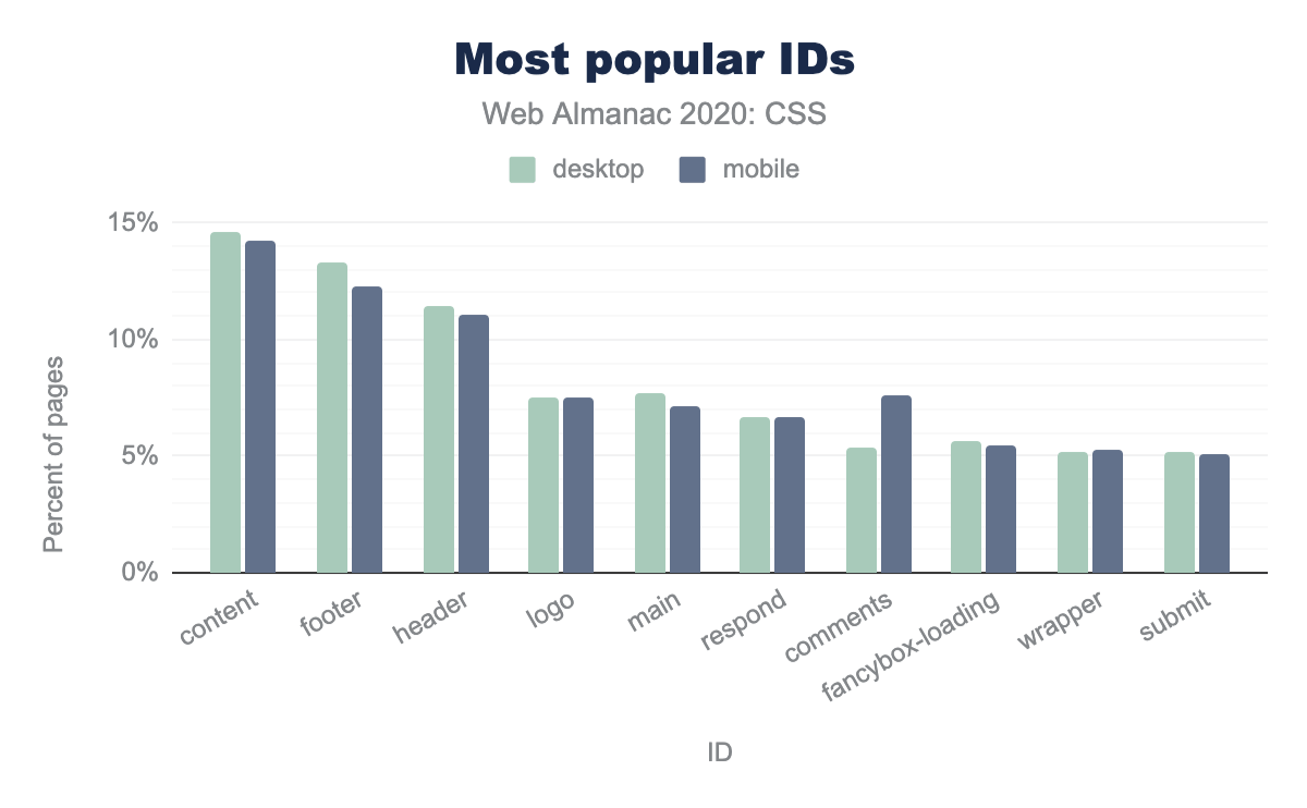
But what are these IDs used for? It turns out that the most popular IDs are structural: #content, #footer, #header, #main, despite corresponding HTML elements existing that could be used as selectors while also improving the semantic markup.
content at 14% of pages. The footer and header IDs have slightly smaller adoption. The logo, main, respond, comments, fancybox-loading, wrapper, and submit IDs have between 5 and 10% adoption on pages. The only notable difference between desktop and mobile is the comments ID used on about 8% of mobile pages but only 5% of desktop pages.IDs can also be used to intentionally reduce or increase specificity. The specificity hack of writing an ID selector as an attribute selector ([id="foo"] instead of #foo to reduce specificity) was surprisingly rare, with only 0.3% of pages using it at least once. Another ID-related specificity hack, using a negation + descendant selector like :not(#nonexistent) .foo instead of .foo to increase specificity, was also very rare, appearing in only 0.1% of pages.
!important
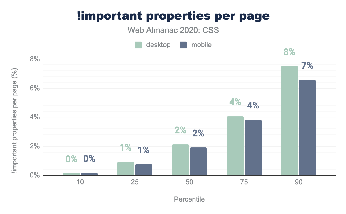
Instead, the old, crude !important is still used a fair bit despite its well-known drawbacks. The median page uses !important in nearly 2% of its declarations, or 1 in 50.
!important in every single declaration!.
Some developers literally cannot get enough of it: we found 2304 desktop pages and 2138 mobile ones that use !important in every single declaration!
!important properties per page.
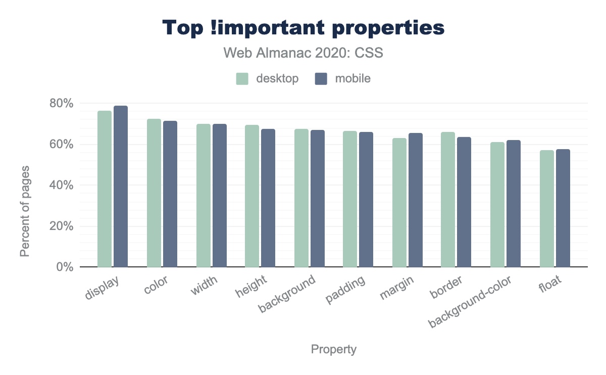
What is it that developers are so keen to override? We looked at breakdown by property and found that nearly 80% of pages use !important with the display property. It is a common strategy to apply display: none !important to hide content in helper classes to override existing CSS that uses display to define a layout mode. This is a side effect of what, in hindsight, was a flaw in CSS. It combined three orthogonal characteristics into one: internal layout mode, flow behavior, and visibility status are all controlled by the display property. There are efforts to separate out these values into separate display keywords so that they can be tweaked independently via custom properties, but browser support is virtually nonexistent for the time being.
!important. Mobile and desktop have similar usage. The display property is used with !important the most, by 79% of mobile pages. In decreasing order, the subsequent properties on 71-58% of mobile pages are: color, width, height, background, padding, margin, border, background-color, and float.!important properties by the percent of pages.
Specificity and classes
Besides keeping ids and !importants few and far between, there is a trend to circumvent specificity altogether by cramming all the selection criteria of a selector in a single class name, thus forcing all rules to have the same specificity and turning the cascade into a simpler last-one-wins system. BEM is a popular methodology of that type, albeit not the only one. While it is difficult to assess how many websites use BEM-style methodologies exclusively, since following it in every rule is rare (even the BEM website uses multiple classes in many selectors), about 10% of pages had a median specificity of (0,1,0), which may indicate mostly following a BEM-style methodology. On the opposite end of BEM, often developers use duplicated classes to increase specificity and nudge a selector ahead of another one (e.g. .foo.foo instead of .foo). This kind of specificity hack is actually more popular than BEM, being present in 14% of mobile websites (9% of desktop)! This may indicate that most developers do not actually want to get rid of the cascade altogether, they just need more control over it.
| Percentile | Desktop | Mobile |
|---|---|---|
| 10 | 0,1,0 | 0,1,0 |
| 25 | 0,2,0 | 0,1,2 |
| 50 | 0,2,0 | 0,2,0 |
| 75 | 0,2,0 | 0,2,0 |
| 90 | 0,3,0 | 0,3,0 |
Attribute selectors
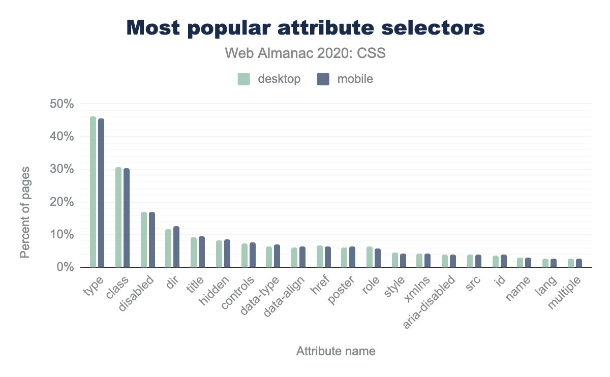
The most popular attribute selector, by far, is on the type attribute, used in 45% of pages, likely to style inputs of different types, e.g. to style textual inputs differently from radios, checkboxes, sliders, file upload controls etc.
type, used on 46% of mobile pages. Next, the class attribute selector is used on 30% of mobile pages. The following attribute selectors are used on between 17 and 3% in descending order: disabled, dir, title, hidden, controls, data-type, data-align, href, poster, role, style, xmlns, aria-disabled, src, id, name, lang, and multiple.Pseudo-classes and pseudo-elements
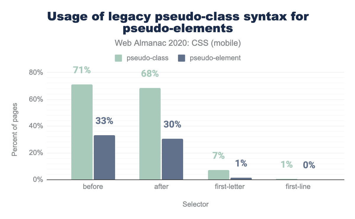
There is always a lot of inertia when we change something in the web platform after it is long established. As an example, the web has still largely not caught up with pseudo-elements having separate syntax compared to pseudo-classes, even though this was a change that happened over a decade ago. All pseudo-elements that are also available with a pseudo-class syntax for legacy reasons are vastly more widespread (2.5x to 5x!) with the pseudo-class syntax.
before pseudo-element is used with pseudo-class syntax on 71% of mobile pages and pseudo-element syntax on 33% of mobile pages. The after pseudo-element is used with class and element syntax on 68% and 30% of mobile pages, first-letter on 7% and 1% of mobile pages, and first-line on 1% and 0% of mobile pages.:pseudo-class syntax for ::pseudo-elements as a percent of mobile pages.
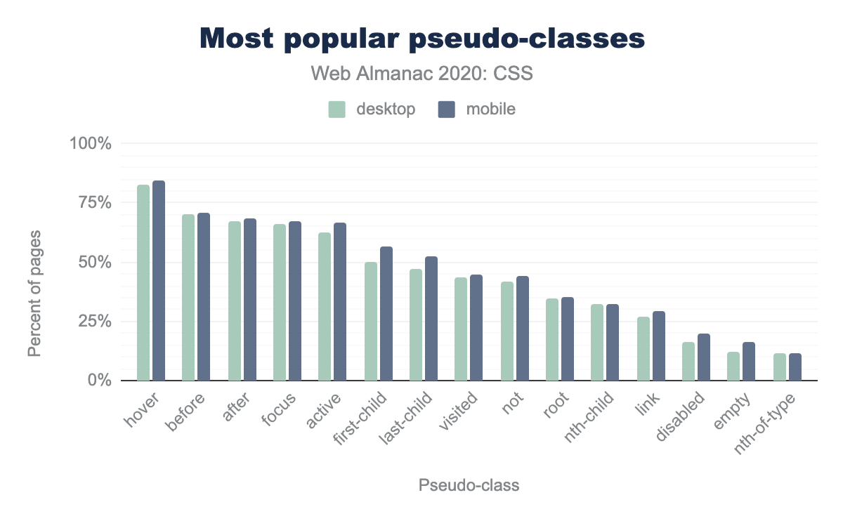
By far the most popular pseudo-classes are user action ones, with :hover, :focus, and :active at the top of the list, all used in over two thirds of pages, indicating that developers like the convenience of specifying declarative UI interactions.
:root seems far more popular than is justified by its function, used in one third of pages. In HTML content, it just selects the <html> element, so why didn’t developers just use html? A possible answer may lie in a common practice related to defining custom properties, which are also highly used, on the :root pseudo-class. Another answer may lie in specificity: :root, being a pseudo-class, has a higher specificity than html: (0, 1, 0) vs (0, 0, 1). It is a common hack to increase specificity of a selector by prepending it with :root, e.g. :root .foo has a specificity of (0, 2, 0) compared to just (0, 1, 0) for .foo. This is often all that is needed to nudge a selector slightly over another one in the cascade race and avoid the sledgehammer that is !important. To test this hypothesis, we also measured exactly that: how many pages use :root at the start of a descendant selector? The results verified our hypothesis: a remarkable 29% of pages use :root that way! Furthermore, 14% of desktop pages and 19% of mobile pages use html at the start of a descendant selector, possibly to give the selector an even smaller specificity boost. The popularity of these specificity hacks strongly indicates that developers need more fine grained control to tweak specificity than what is afforded to them via !important. Thankfully, this is coming soon with :where(), which is already implemented across the board (albeit behind a flag in Chrome for now).
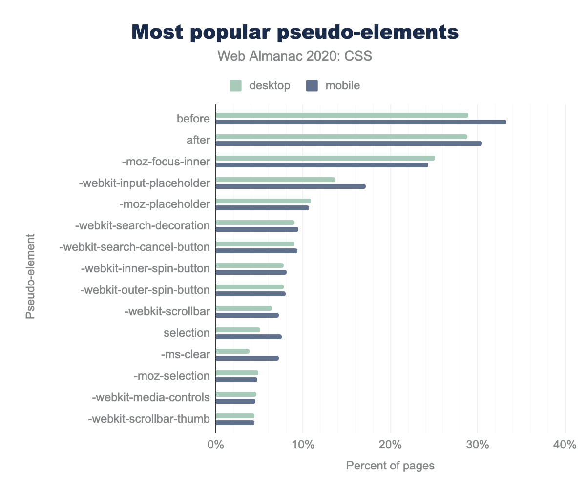
hover, used on 84% of pages. The following pseudo-classes decrease in popularity from 71% to 12% almost linearly: before, after, focus, active, first-child, last-child, visited, not, root, nth-child, link, disabled, empty, nth-of-type.When it comes to pseudo-elements, after the usual suspects ::before and ::after, nearly all popular pseudo-elements were browser extensions for styling form controls and other built-in UI, strongly echoing the developer need for more fine-grained control over styling of built in UI. Styling of focus rings, placeholders, search inputs, spinners, selection, scrollbars, media controls was especially popular.
before, used on 33% of mobile pages. The after pseudo-element is used on 30% of mobile pages. -moz-focus-inner is used on 24% of pages. The popularity drops after those from 17% to 4% in decreasing order: -webkit-input-placeholder, -moz-placeholder, -webkit-search-decoration, -webkit-search-cancel-button, -webkit-inner-spin-button, -webkit-outer-spin-button, -webkit-scrollbar (7%), selection, -ms-clear, -moz-selection, -webkit-media-controls, and -webkit-scrollbar-thumb.Values and units
CSS provides a number of ways of specifying values and units, either in set lengths or calculations or based on global keywords.
Lengths
The humble px unit has gotten a lot of negative press over the years. At first, because it didn’t play nicely with old Internet Explorer’s zoom functionality, and, more recently, because there are better units for most tasks that scale based on another design factor, such as viewport size, element font size, or root font size, reducing maintenance effort by making implicit design relationships explicit. The main selling point of px—its correspondence to one device pixel giving designers full control—is also gone now, as a pixel is not a device pixel anymore with the modern high pixel density screens. Despite all this, CSS pixels still nearly ubiquitously drive the web’s designs.
<length> values that use the px unit.
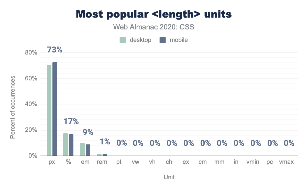
The px unit is still going strong as the most popular length unit overall, with a whopping 72.58% of all length values across all style sheets using px! And if we exclude percentages (since they are not really a unit) the share of px increases even more, to 84.14%.
% (percent sign), at 17%, followed by em at 9%, and rem at 1%. The following units all have usage so low that they round to 0%: pt, vw, vh, ch, ex, cm, mm, in, vmin, pc, and vmax.<length> units as a percent of occurrences.
How are these px distributed across properties? Is there any difference depending on the property? Most definitely. For example, as one might expect, px is far more popular in borders (80-90%) compared to font-related metrics such as font-size, line-height or text-indent. However, even for those, px usage vastly outnumbers any other unit. In fact, the only properties for which another unit (any other unit) is more used than px are vertical-align (55% em), mask-position (50% em), padding-inline-start (62% em), margin-block-start and margin-block-end (65% em), and the brand new gap with 62% rem.
One could easily argue that a lot of this content is just old, written before authors were more enlightened about using relative units to make their designs more adaptable and save themselves time down the line. However, this is easily debunked by looking at more recent properties such as grid-gap (62% px).
| Property | px |
<number> |
em |
% |
rem |
pt |
|---|---|---|---|---|---|---|
font-size |
70% | 2% | 17% | 6% | 4% | 2% |
line-height |
54% | 31% | 13% | 3% | ||
border |
71% | 27% | 2% | |||
border-radius |
65% | 21% | 3% | 10% | ||
text-indent |
32% | 51% | 8% | 9% | ||
vertical-align |
29% | 12% | 55% | 4% | ||
grid-gap |
63% | 11% | 9% | 1% | 16% | |
mask-position |
50% | 50% | ||||
padding-inline-start |
33% | 5% | 62% | |||
gap |
21% | 16% | 1% | 62% | ||
margin-block-end |
4% | 31% | 65% | |||
margin-inline-start |
38% | 46% | 14% | 1% |
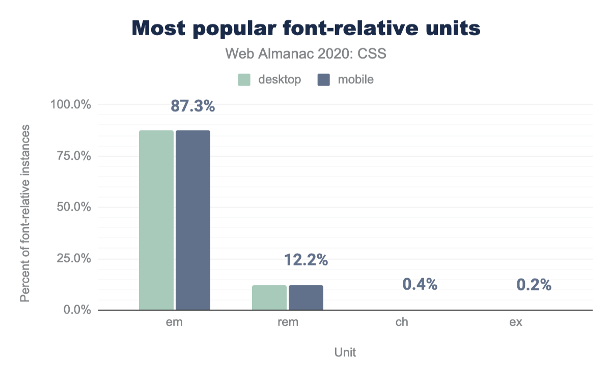
Similarly, despite the much touted advantages of rem vs em for many use cases, and its universal browser support for years, the web has still largely not caught up with it: the trusty em accounts for 87% of all font-relative units usage and rem trails far behind with 12%. We did see some usage of ch (width of the ’0’ glyph) and ex (x-height of the font in use) in the wild, but very small (only 0.37% and 0.19% of all font-relative units).
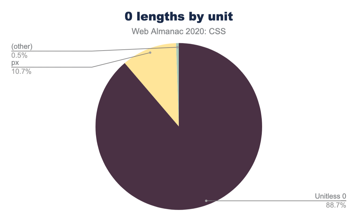
em is used overwhelmingly on 87.3% of instances, followed by rem at 12.2, ch at 0.4%, and ex at 0.2% of instances on mobile pages.Lengths are the only types of CSS values for which we can omit the unit when the value is zero, i.e. we can write 0 instead of 0px or 0em etc. Developers (or CSS minifiers?) are taking advantage of this extensively: Out of all 0 values, 89% were unitless.
px unit at 10.7%, and other units on 0.5% of instances.Calculations
When the calc() function was introduced for performing calculations between different units in CSS, it was a revolution. Previously, only preprocessors were able to accommodate such calculations, but the results were limited to static values and unreliable, since they were missing the dynamic context that is often necessary.
Today, calc() has been supported by every browser for nine years already, so it comes as no surprise that it has been widely adopted with 60% of pages using it at least once. If anything, we expected even higher adoption than this.
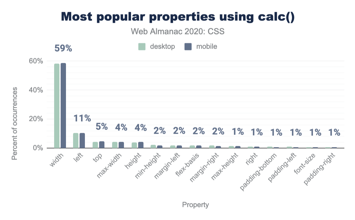
calc() is primarily used for lengths, with 96% of its usage being concentrated in properties that accept <length> values, and 60% of that (58% of total usage) on the width property!
calc() as a percent of occurrences.
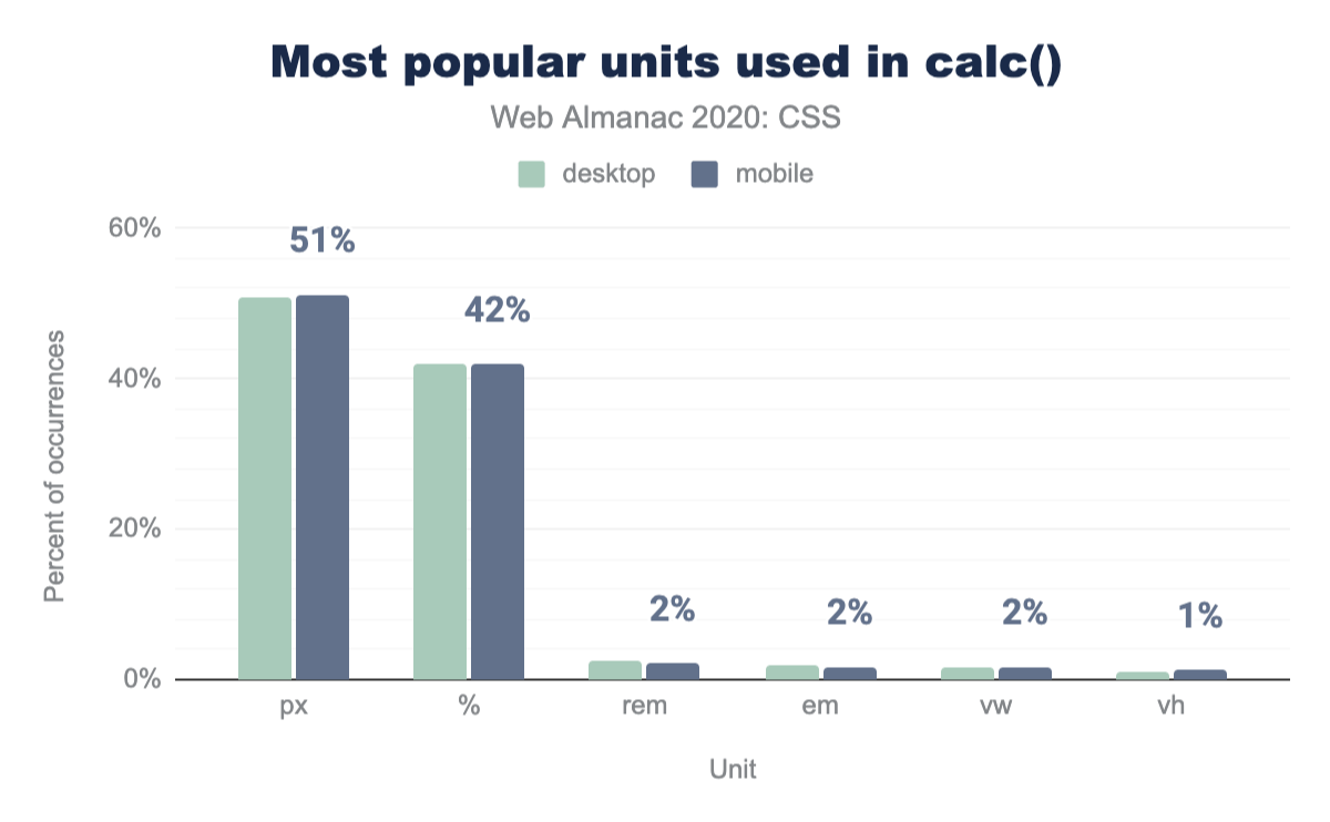
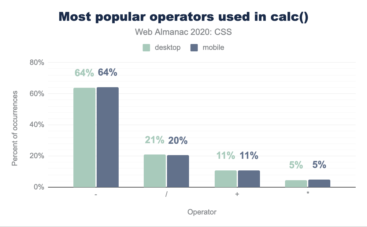
It appears that most of this usage is to subtract pixels from percentages, as evidenced by the fact that the most common units in calc() are px (51% of calc() usage) and % (42% of calc() usage), and that 64% of calc() usage involves subtraction. Interestingly, the most popular length units with calc() are different than the most popular length units overall (e.g. rem is more popular than em, followed by viewport units), most likely due to the fact that code using calc() is newer.
width property, 59% of calc occurrences on mobile pages. it is used on the left property 11% of the time, top 5%, max-width 4%, height 4%, and the remaining properties are decreasing at 2% and 1%: min-height, margin-left, flex-basis, margin-right, max-height (1%), right, padding-bottom, padding-left, font-size, and padding-right.calc() as a percent of occurrences.
calc() as a percent of occurrences.
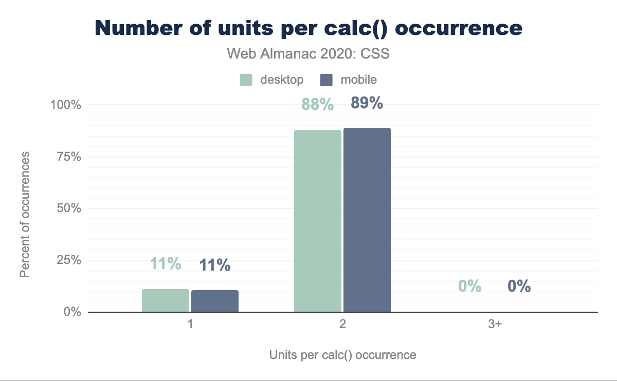
Most calculations are very simple, with 99.5% of calculations involving up to 2 different units, 88.5% of calculations involving up to 2 operators and 99.4% of calculations involving one set of parentheses or fewer (3 out of 4 calculations include no parentheses at all).
calc() occurrence.
Global keywords and all
For a long time, CSS only supported one global keyword: inherit, which enables the resetting of an inheritable property to its inherited value or reusing the parent’s value for a given non-inheritable property. It turns out the former is far more common than the latter, with 81.37% of inherit usage being found on inheritable properties. The rest is mostly to inherit backgrounds, borders, or dimensions. The latter likely indicates layout struggles, as with the proper layout mode one rarely needs to force width and height to inherit.
The inherit keyword has been particularly useful for resetting the gory default link colors to the parent’s text color, when we intend to use something other than color as an affordance for links. It is therefore no surprise that color is the most common property that inherit is used on. Nearly one third of all inherit usage is found on the color property. 75% of pages use color: inherit at least once.
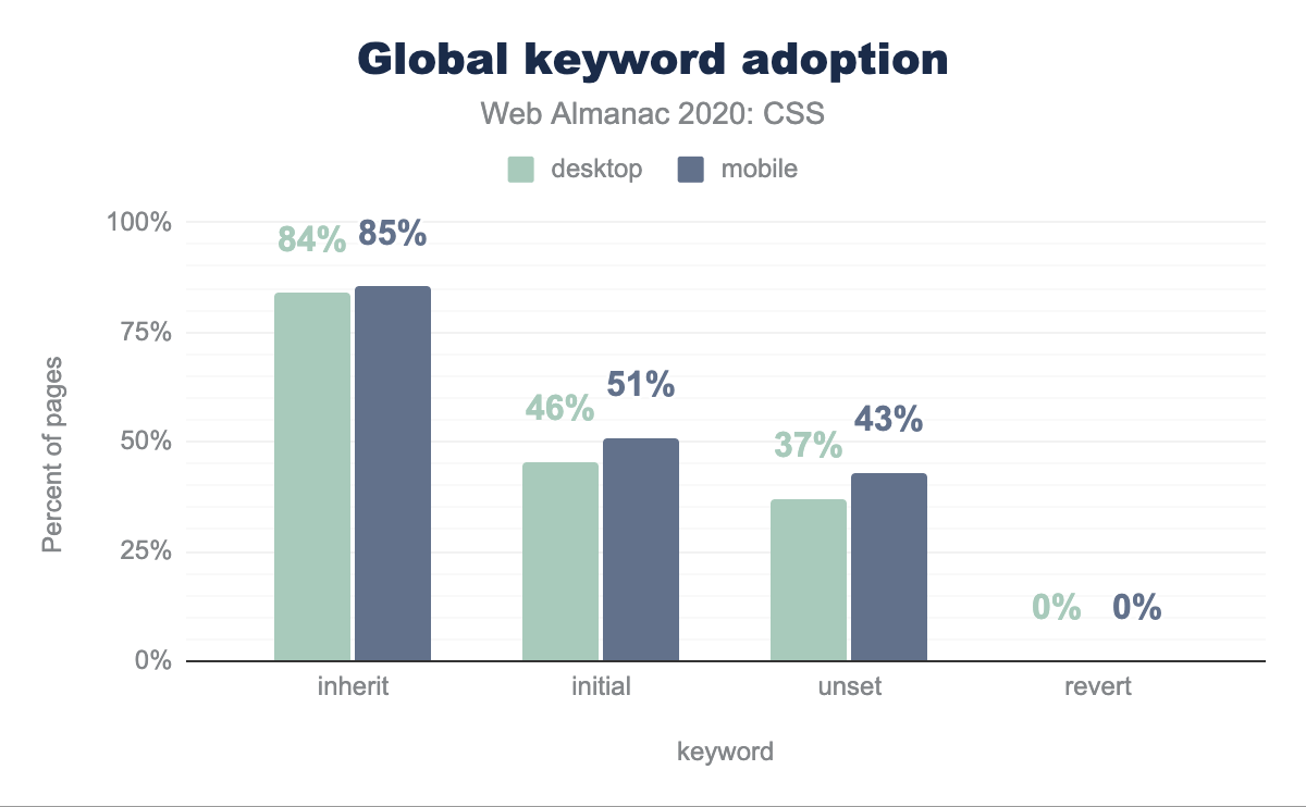
While a property’s initial value is a concept that has existed since CSS 1, it only got its own dedicated keyword, initial, to explicitly refer to it 17 years later, and it took another two years for that keyword to gain universal browser support in 2015. It is therefore no surprise that it is used far less than inherit. While the old inherit is found on 85% of pages, initial appears in 51% of them. Furthermore, there is a lot of confusion about what initial actually does, since display tops the list of properties most commonly used with initial, with display: initial appearing in 10% of pages. Presumably, the developers thought that this resets display to its value from the user agent stylesheet value and were using it to toggle display: none on and off. However, the initial value of display is inline, so display: initial is just another way to write display: inline and has no context-dependent magical properties.
Instead, display: revert would have actually done what these developers likely expected and would have reset display to the UA value for the given element. However, revert is much newer: it was defined in 2015 and only gained universal browser support this year, which explains its underuse: it only appears in 0.14% of pages and half of its usage is line-height: revert;, found in recent versions of WordPress’ TwentyTwenty theme.
The last global keyword, unset, is essentially a hybrid of initial and inherit. On inherited properties it becomes inherit and on the rest it becomes initial, essentially resetting the property across all cascade origins. Similarly, to initial, it was defined in 2013 and gained full browser support in 2015. Despite unset’s higher utility, it is used in only 43% of pages, whereas initial is used in 51% of pages. Furthermore, besides max-width and min-width, in every other property initial usage outweighs unset usage.
inherit keyword is used on 85% of mobile pages, initial on 51%, unset on 43%, and revert on approximately 0%.The all property was introduced in 2013 and gained near-universal support in 2016 (except Edge) and universal support earlier this year. It is a shorthand of nearly every property in CSS (except custom properties, direction, and unicode-bidi), and only accepts the four global keywords (initial, inherit, unset, and revert) as values. It was envisioned as a one liner CSS reset, either as all: unset or all: revert, depending on what kind of reset we wanted. However, adoption is still very low: we only found all on 477 pages (0.01% of all pages), and only used with the revert keyword.
Color
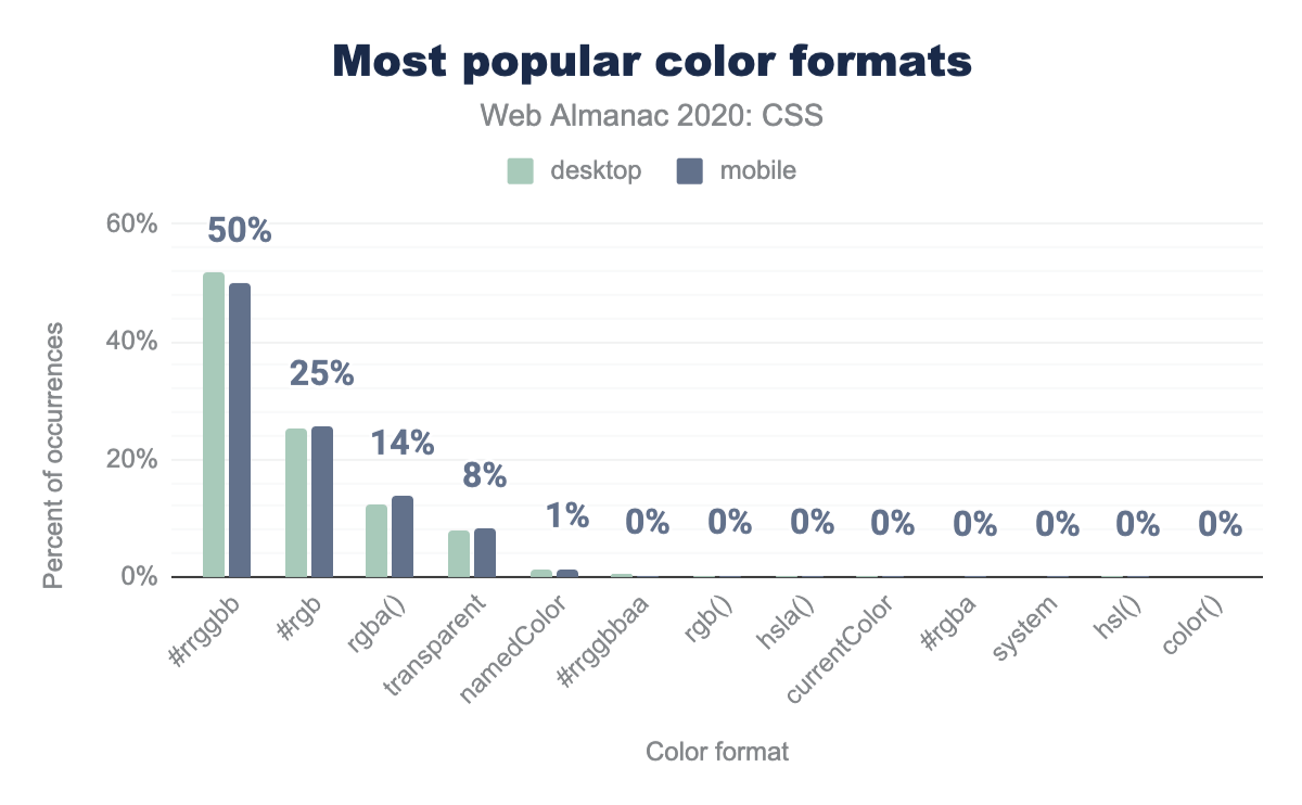
They say the old jokes are the best, and that goes for colors too. The original, cryptic, #rrggbb hex syntax remains the most popular way to specify a color in CSS in 2020: Half of all colors are written that way. The next most popular format is the somewhat shorter #rgb three-digit hex format at 26%. While it is shorter, it is also able to express way fewer colors; only 4096, out of the 16.7 million sRGB values.
#rrggbb color format is used in 50% of occurrences on mobile pages, with desktop slightly higher at 52%. The #rgb format is used in 25% of occurrences, followed by rgba() at 14%, transparent at 8%, a named color (like red) at 1%, and the remaining color formats all have approximately 0% relative popularity on mobile pages: #rrggbbaa, rbg(), hsla(), currentColor, #rgba, a system color, hsl(), and color().Similarly, 99.89% of functionally specified sRGB colors are using the since-forever legacy format with commas rgb(127, 255, 84) rather than the new comma-less form rgb(127 255 84). Because, despite all modern browsers accepting the new syntax, changing offers zero advantage to developers.
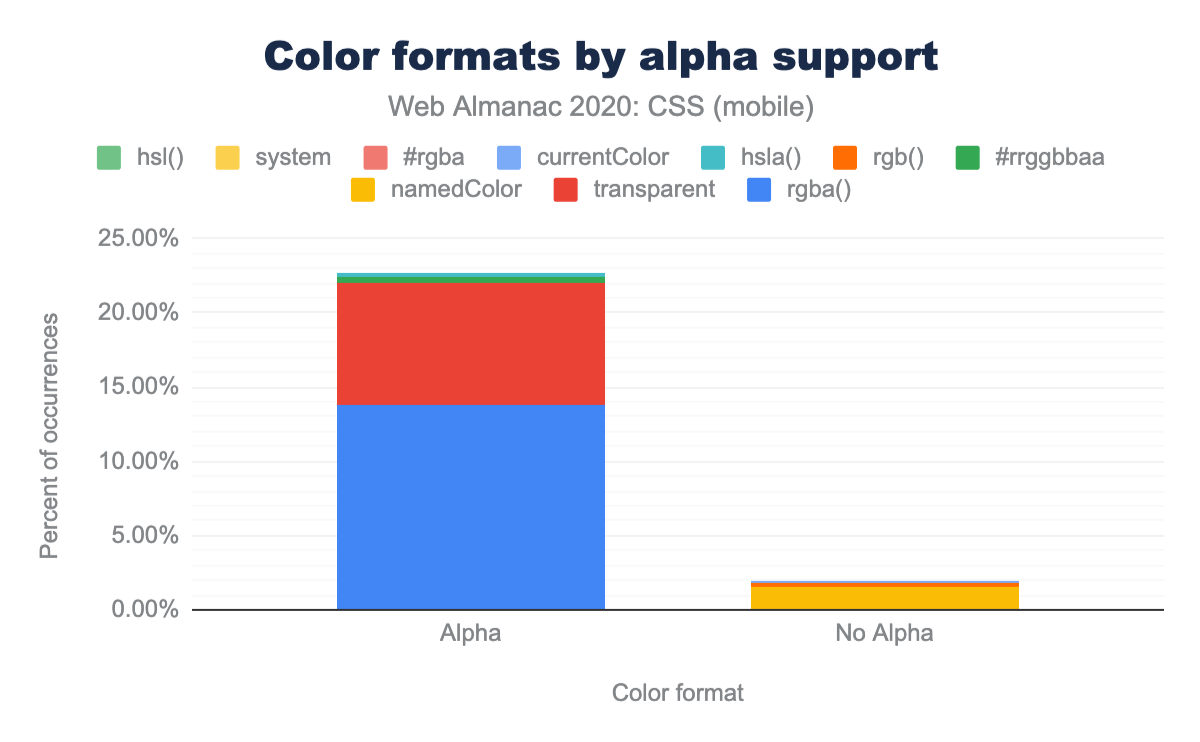
So why do people stray from these tried and true formats? To express alpha transparency. This is clear when you look at rgba(), which is used 40 times more than rgb() (13.82% vs 0.34% of all colors) and hsla(), which is used 30 times more than hsl() (0.25% vs 0.01% of all colors).
HSL is supposed to be easy to understand and easy to modify. But these numbers show that in practice, HSL is used in stylesheets far less than RGB, likely because those advantages are greatly over-stated.
#rrggbb and #rgb. Color formats that support alpha add up to about 23% of occurrences, while color formats that do not support alpha add up to only 2% of occurrences on mobile pages.#rrggbb and #rgb).
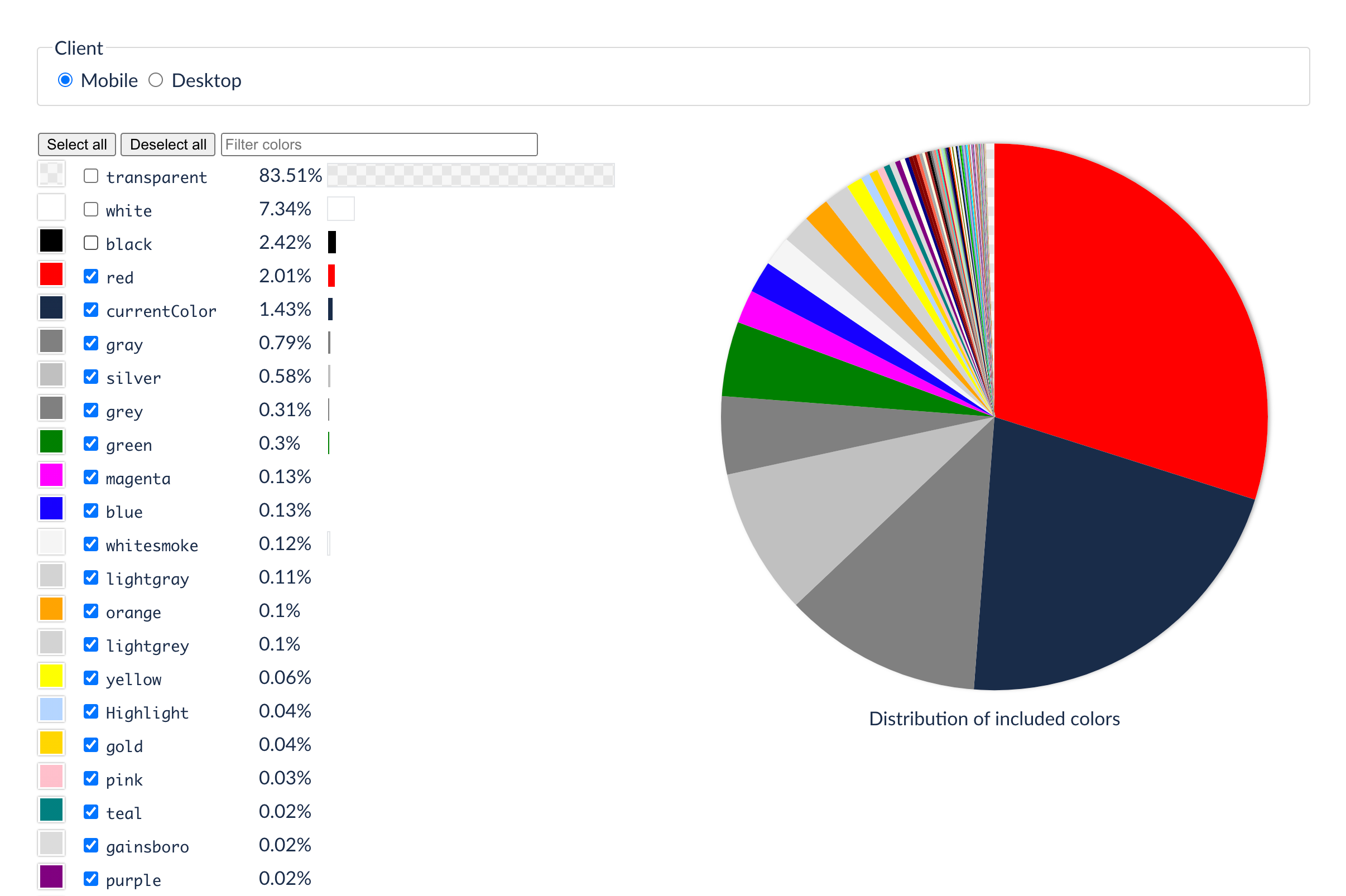
What about named colors? The keyword transparent, which is just another way to say rgb(0 0 0 / 0), is most popular, at 8.25% of all sRGB values (66% of all named-color usage); followed by all the named (X11) colors—I’m looking at you, papayawhip—at 1.48%. The most popular of these were the easily understood names like white, black, red, gray, blue. whitesmoke was the most common of the non-ordinary names (sure, we can visualize whitesmoke, right) while the likes of gainsboro, lightCoral and burlywood were used way less. We can understand why—you need to look them up to see what they actually mean!
And if you are going for fanciful color names, why not define your own with CSS Custom properties? --intensePurple and --corporateBlue mean whatever you need them to mean. This probably explains why 50% of Custom Properties are used for colors.
| Keyword | Desktop | Mobile | |
|---|---|---|---|
| transparent | 84.04% | 83.51% | |
| white | 6.82% | 7.34% | |
| black | 2.32% | 2.42% | |
| red | 2.03% | 2.01% | |
| currentColor | 1.43% | 1.43% | |
| gray | 0.75% | 0.79% | |
| silver | 0.66% | 0.58% | |
| grey | 0.35% | 0.31% | |
| green | 0.36% | 0.30% | |
| magenta | 0.00% | 0.13% | |
| blue | 0.16% | 0.13% | |
| whitesmoke | 0.17% | 0.12% | |
| lightgray | 0.06% | 0.11% | |
| orange | 0.12% | 0.10% | |
| lightgrey | 0.04% | 0.10% | |
| yellow | 0.08% | 0.06% | |
| Highlight | 0.01% | 0.04% | |
| gold | 0.04% | 0.04% | |
| pink | 0.03% | 0.03% | |
| teal | 0.03% | 0.02% |
And, lastly, the once-deprecated—now partially un-deprecated—system colors like Canvas and ThreeDDarkShadow: these were a terrible idea, introduced to emulate the typical user interface of things like Java or Windows 95, and already unable to keep up with Windows 98, they soon fell by the wayside. Some sites use these system colors to try and fingerprint you, a loophole that we are trying to close as we speak. There are few good reasons to use them, and most websites (99.99%) don’t, so we are all good.
The rather useful value currentColor, surprisingly, trailed at 0.14% of all sRGB colors (1.62% of all named colors).
All the colors we discussed so far have one thing in common: sRGB, the standard color space for the web (and for High Definition TV, which is where it came from). Why is that so bad? Because it can only display a limited range of colors: your phone, your TV, and probably your laptop are able to display much more vivid colors due to advances in display technology. Displays with wide color gamut, which used to be reserved for well-paid professional photographers and graphic designers, are now available to everyone. Native apps use this capability, as do digital movies and streaming TV services, but until recently the web was missing out.
And we are still missing out. Despite being implemented in Safari in 2016, the use of display-p3 color in web pages is vanishingly small. Our crawl of the web found only 29 mobile and 36 desktop pages using it! (And more than half of those were syntax errors, mistakes, or attempts to use the never-implemented color-mod() function). We were curious why.
Compatibility, right? You don’t want things to break? No. In the stylesheets we examined, we found solid use of fallback: with document order, the cascade, @supports, the color-gamut media query, all that good stuff. So in a stylesheet we would see the color the designer wanted, expressed in display-p3, and also a fallback sRGB color. We computed the visible difference (a calculation called ΔE2000) between the desired and fallback color and this was typically quite modest. A small tweak. A careful exploration. In fact, 37.6% of the time, the color specified in display-p3 actually fell inside the range of colors (the gamut) that sRGB can manage. It seems people are just cautiously experimenting with this at the moment rather than to get real gains, but more is surely to come in this space, so one to watch.
| sRGB | display-p3 | ΔE2000 | In gamut | |
|---|---|---|---|---|
rgba(255,205,63,1) |
color(display 1 0.80 0.25 / 1) |
3.880 | false | |
rgba(120,0,255,1) |
color(display 0.47 0 1 / 1) |
1.933 | false | |
rgba(121,127,132,1) |
color(display 0.48 0.50 0.52 / 1) |
0.391 | true | |
rgba(200,200,200,1) |
color(display 0.78 0.78 0.78 / 1) |
0.274 | true | |
rgba(97,97,99,1) |
color(display 0.39 0.39 0.39 / 1) |
1.474 | true | |
rgba(0,0,0,1) |
color(display 0 0 0 / 1) |
0.000 | true | |
rgba(255,255,255,1) |
color(display 1 1 1 / 1) |
0.015 | false | |
rgba(84,64,135,1) |
color(display 0.33 0.25 0.53 / 1) |
1.326 | true | |
rgba(131,103,201,1) |
color(display 0.51 0.40 0.78 / 1) |
1.348 | true | |
rgba(68,185,208,1) |
color(display 0.27 0.75 0.82 / 1) |
5.591 | false | |
rgb(255,0,72) |
color(display 1 0 0.2823 / 1) |
3.529 | false | |
rgba(255,205,63,1) |
color(display 1 0.80 0.25 / 1) |
3.880 | false | |
rgba(241,174,50,1) |
color(display 0.95 0.68 0.17 / 1) |
4.701 | false | |
rgba(245,181,40,1) |
color(display 0.96 0.71 0.16 / 1) |
4.218 | false | |
rgb(147, 83, 255) |
color(display 0.58 0.33 1 / 1) |
2.143 | false | |
rgba(75,3,161,1) |
color(display 0.29 0.01 0.63 / 1) |
1.321 | false | |
rgba(255,0,0,0.85) |
color(display 1 0 0 / 0.85) |
7.115 | false | |
rgba(84,64,135,1) |
color(display 0.33 0.25 0.53 / 1) |
1.326 | true | |
rgba(131,103,201,1) |
color(display 0.51 0.40 0.78 / 1) |
1.348 | true | |
rgba(68,185,208,1) |
color(display 0.27 0.75 0.82 / 1) |
5.591 | false | |
#6d3bff |
color(display .427 .231 1) |
1.584 | false | |
#03d658 |
color(display .012 .839 .345) |
4.958 | false | |
#ff3900 |
color(display 1 .224 0) |
7.140 | false | |
#7cf8b3 |
color(display .486 .973 .702) |
4.284 | true | |
#f8f8f8 |
color(display .973 .973 .973) |
0.028 | true | |
#e3f5fd |
color(display .875 .945 .976) |
1.918 | true | |
#e74832 |
color(display .905882353 .282352941 .196078431 / 1 ) |
3.681 | true | |
The purplish colors are similar in sRGB and display-p3, perhaps because both those color spaces have the same blue primary. Various reds, orange-yellows, and greens are near the sRGB gamut boundary (nearly as saturated as possible) and map to analogous points near the display-p3 gamut boundary.
There seem to be two reasons why the web is still trapped in sRGB land. The first is lack of tools, lack of good color pickers, lack of understanding of what more vivid colors are available. But the major reason, we think, is that to date Safari is the only browser to implement it. This is changing, rapidly—Chrome and Firefox are both implementing right now—but until that support ships, probably using display-p3 is too much effort for too little gain because only 17% of viewers will see those colors. Most people will see the fallback. So current usage is a subtle shift in color vibrancy, rather than a big difference.
It will be interesting to see how the use of display-p3 color (other options exist, but this is the only one we found in the wild) changes over the next year or two.
Because wide color gamut (WCG) is only the beginning. The TV and movie industry has already moved past P3 to an even wider gamut, Rec. 2020; and also a wider range of lightness, from blinding reflections to deepest shadows. High Dynamic Range (HDR) has already arrived in the home, especially on games, streaming TV and movies. The web has a bunch of catching up to do.
Gradients
Despite minimalism and flat design being all the rage, CSS gradients are used in 75% of pages. As expected, nearly all gradients are used in backgrounds. 74.45% of pages specify gradients in backgrounds, but only 7% in any other property.
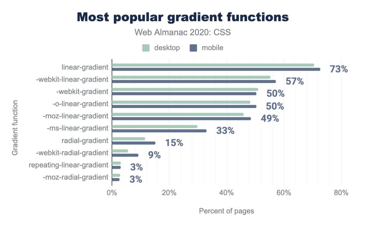
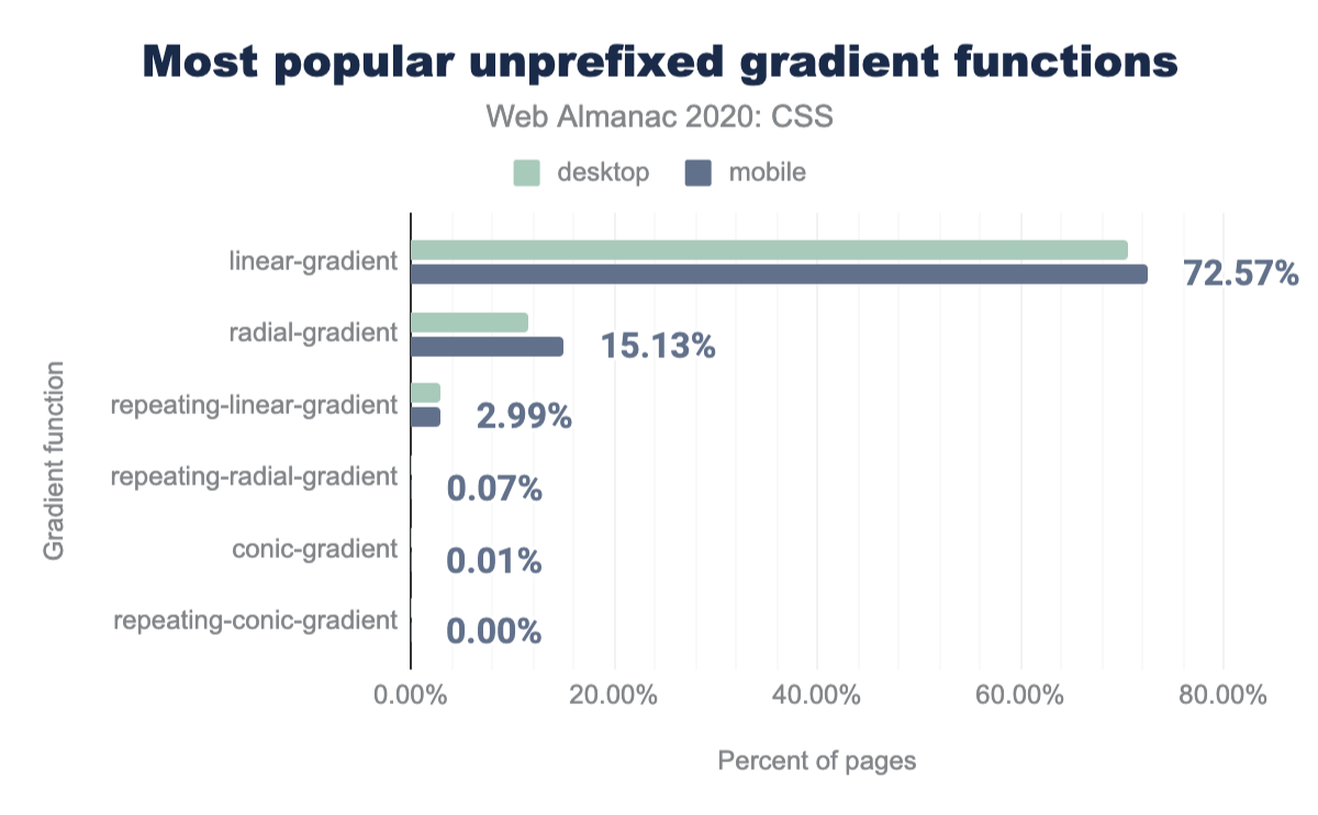
Linear gradients are 5 times more popular than radial ones, appearing in almost 73% of pages, compared to 15% for radial gradients. The difference in popularity is so staggering, that even -ms-linear-gradient(), which was never needed (Internet Explorer 10 supported gradients both with and without the -ms- prefix), is more popular than radial-gradient()! The newly supported conic-gradient() is even more underutilized, appearing in only 652 desktop pages (0.01%) and 848 mobile pages (0.01%), which is expected, since Firefox has only just shipped its implementation to the stable channel.
Repeating gradients of all types are fairly underused too, with repeating-linear-gradient() appearing in only 3% of pages and the others trailing behind even more (repeating-conic-gradient() is only used in 21 pages!).
Prefixed gradients are also still very common, even though prefixes haven’t been needed in gradients since 2013. It is notable that -webkit-gradient() is still used in half of all websites, even though it hasn’t been needed since 2011. And -webkit-linear-gradient() is still the second most used gradient function of all, appearing in 57% of websites, with the other prefixed forms also being used in a third to half of pages.
linear-gradient, used on 73% of mobile pages. Followed by -webkit-linear-gradient on 57%, -webkit-gradient and -linear-gradient on 50%, -moz-linear-gradient on 49%, -ms-linear-gradient on 33%, radial-gradient on 15%, -webkit-radial-gradient on 9%, and repeating-linear-gradient and -moz-radial-gradient used on 3% of mobile pages.linear-gradient are used on 72.57% of mobile pages, radial-gradient on 15.13%, repeating-linear-gradient on 2.99%, repeating-radial-gradient on 0.07%, conic-gradient on 0.01%, and repeating-conic-gradient on approximately 0.00% of mobile pages.Using color stops with different colors in the same position (hard stops) to create stripes and other patterns is a technique first popularized by Lea Verou in 2010, which by now has many interesting variations, including some really cool ones with blend modes. While it may seem like a hack, hard stops are found in 50% of pages, indicating a strong developer need for lightweight graphics from within CSS without resorting to image editors or external SVG.
Interpolation hints (or as Adobe, who popularized the technique, calls them: “midpoints”) are found on only 22% of pages, despite near universal browser support since 2015. Which is a shame, because without them, the color stops are connected by straight-lines in the color space, rather than smooth curves. This low usage probably reflects a misunderstanding of what they do, or how to use them; contrast this with CSS transitions and animations, where easing functions (which do much the same thing, i.e. connect the keyframes with curves rather than jerky straight lines) are much more commonly used (80% of transitions). “Midpoints” is not a very understandable description, and “interpolation hint” sounds like you are helping the browser to do simple arithmetic.
Most gradient usage is rather simple, with over 75% of gradients found across the entire dataset only using 2 color stops. In fact, fewer than half of pages contain even a single gradient with more than 3 color stops!
The gradient with the most color stops is this one with 646 stops! So pretty! This is almost certainly generated, and the resulting CSS code is 8KB, so a 1px tall PNG would likely have done the job as well, with a smaller footprint (our image below is 1.1 KB).
Layout
CSS now has a number of layout options—a far cry from the days when tables had to be used for layouts. Flexbox, Grid and Multiple-column layouts are now well supported in most browsers so let’s look at how these are being used.
Flexbox and Grid adoption
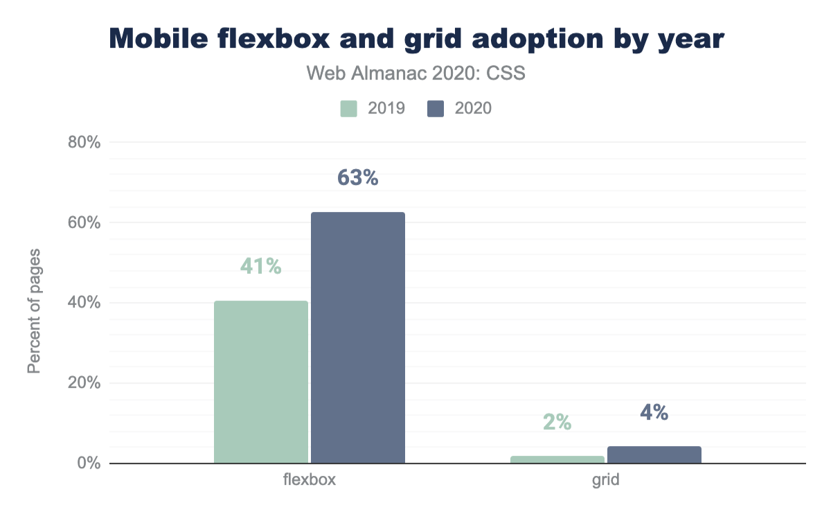
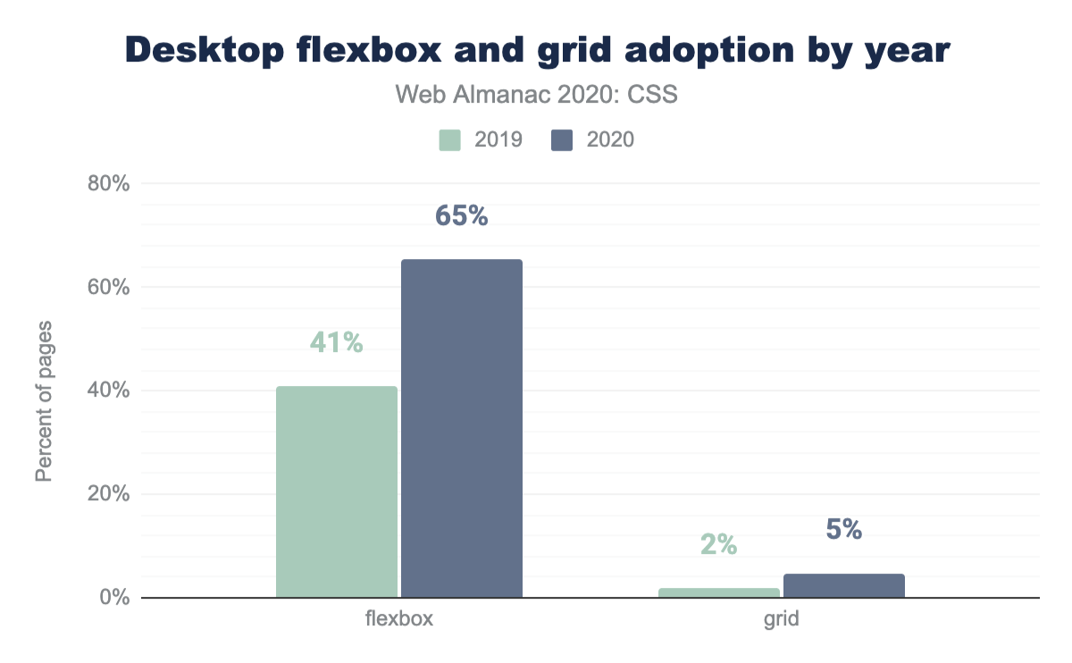
In the 2019 edition, 41% of pages across mobile and desktop were reported as containing Flexbox properties. In 2020, this number has grown to 63% for mobile and 65% for desktop. With the number of legacy sites developed before Flexbox was a viable tool still in existence, we can safely say there is wide adoption of this layout method.
If we look at Grid layout, the percentage of sites using Grid layout has grown to 4% for mobile and 5% for desktop. Usage has doubled since last year, but still lags far behind flex layout.
Note that unlike most other metrics in this chapter this is actual measured Grid usage, and not just grid-related properties and values that are specified in a stylesheet and potentially not used. While at first glance this may seem more accurate, one thing to keep in mind is that HTTP Archive crawls home pages, so this data may be skewed lower due to grids often appearing more in internal pages.
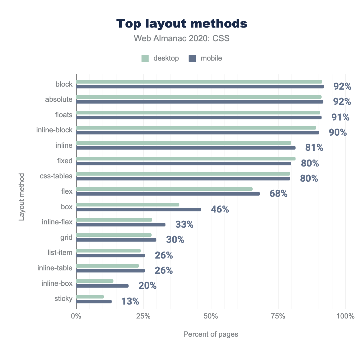
So, let’s look at another metric as well: how many pages specify display: grid and display: flex in their stylesheets? That metric puts Grid layout at significantly higher adoption, with 30% of pages using display: grid at least once. It does not however affect the number for Flexbox as significantly, with 68% of pages specifying display: flex. While this sounds like impressively high adoption for Flexbox, it is worth noting that CSS tables are still far more popular with 80% of pages using table display modes! Some of this usage may be due to certain types of clearfix which use display: table, and not for actual layout.
display, position, and float properties.
Given that Flexbox was usable in browsers earlier than Grid layout, it is likely that some of the Flexbox usage is for setting up a grid system. In order to use Flexbox as a grid, authors need to disable some of the inherent flexibility of Flexbox. To do this you set the flex-grow property to 0, then size flex items using percentages. Using this information we were able to report that 19% of sites both on desktop and mobile were using Flexbox in this grid-like way.
The reasons for choosing Flexbox over Grid are frequently cited as browser support, given that Grid layout was not supported in Internet Explorer. In addition, some authors may well not have learned Grid layout yet or are using a framework with a Flexbox-based grid system. The Bootstrap framework currently uses a Flexbox-based grid, in common with several other popular framework choices.
Usage of different Grid layout techniques
The Grid layout specification gives a number of ways to describe and define layout in CSS. The most basic usage involves laying items out from one grid line to another. What about naming lines, or use of grid-template-areas?
For named lines, we checked for the presence of square brackets in a track listing. The name or names being placed inside square brackets.
.wrapper {
  display: grid;
  grid-template-columns: [main-start] 1fr [content-start] 1fr [content-end] 1fr [main-end];
}
The result of this showed that 0.23% of Grid-using pages on mobile had named lines, and 0.27% on desktop.
The Grid template areas feature, allowing authors to name grid items then place them on the grid as the value of the grid-template-areas property, fared a little better. Of Grid-using sites, 19% on mobile and 20% on desktop were using this method.
These results show that not only is Grid layout usage still relatively low on production websites, but the usage of it is also relatively simple. Authors are choosing to use the simple line-based placement over methods which would allow them to name lines and areas. While there is nothing wrong in choosing to do so, I wonder if slow adoption of Grid layout is partly due to the fact that authors haven’t yet realized the power of these features. If Grid layout is seen as essentially Flexbox with poor browser support, this would certainly make it a less compelling choice.
Multiple-column layout
The multiple-column layout, or multicol, specification enables laying out of content in columns, much as in a newspaper. While popular in CSS as used for print, it is less useful on the web due to the risk of creating a situation where a reader needs to scroll up and down to read the content. Based on the data, however, there are significantly more pages using multicol than Grid layout with 15.33% on the desktop and 14.95% on mobile. While basic multicol properties are well supported, more complex usage and controlling column breaks with fragmentation has patchy support. Considering this, it was quite surprising to see how much usage there is.
Box sizing
It is useful to know how big the boxes on your page are going to be, but with the standard CSS box model adding padding and border onto the size of the content-box, the size you gave your box is smaller than the box rendered on your page. While we can’t change history, the box-sizing property allows authors to switch to applying the specified size to the border-box, so the size you set is the size you see rendered. How many sites are using the box-sizing property? Most of them! The box-sizing property appears in 83.79% of desktop CSS and 86.39% on mobile.
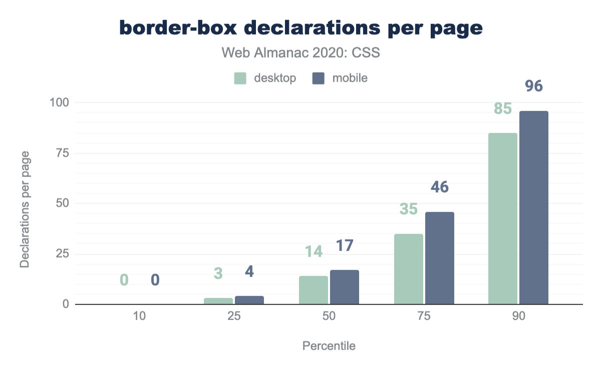
box-sizing declarations per page for desktop and mobile. The mobile distribution leads desktop by 0 to 11 declarations per page, growing in the higher percentiles. The mobile distribution’s 10, 25, 50, 75, and 90th percentiles are: 0, 4, 17, 46, and 96 border-box declarations per page.border-box declarations per page.
The median desktop page has 14 box-sizing declarations. Mobile has 17. Perhaps due to component systems inserting the declaration per component, rather than globally as a rule for all elements in the stylesheet.
Transitions and animations
Transitions and animations have overall become very popular with the transition property being used on 81% of all pages and animation on 73% of mobile pages and 70% of desktop pages. It is somewhat surprising that usage is not lower on mobile, where one would expect that conserving battery power would be a priority. On the other hand, CSS animations are far more battery efficient than JS animation, especially the majority of them that just animate transforms and opacity (see next section).
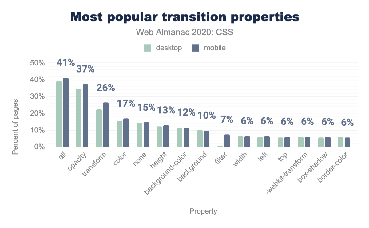
The single most common transition property specified is all, used in 41% of pages. This is a little baffling because all is the initial value, so it does not actually need to be explicitly specified. After that, fade in/out transitions appear to be the most common type, used in over one third of crawled pages, followed by transitions on the transform property (most likely spin, scale, movement transitions). Surprisingly, transitioning height is much more popular than transitioning max-height, even though the latter is a commonly taught workaround when the start or end height is unknown (auto). It was also surprising to see significant usage for the scale property (2%), despite its lack of support beyond Firefox. Intentional usage of cutting edge CSS, a typo, or a misunderstanding of how to animate transforms?
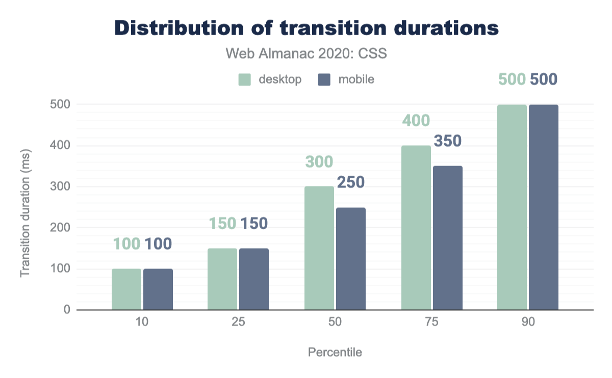
all, used on 41% of pages, followed by opacity at 37%, transform at 26%, color at 17%, none at 15%, height at 13%, background-color at 12%, background at 10%, filter at 7%, and the remaining properties used on 6% of mobile pages: width, left, top, -webkit-transform, box-shadow, and border-color.We were glad to discover that most of these transitions are fairly short, with the median transition duration being only 300ms, and 90% of websites having median durations of less than half a second. This is generally good practice, as longer transitions can make a UI feel sluggish, while a short transition communicates a change without getting in the way.
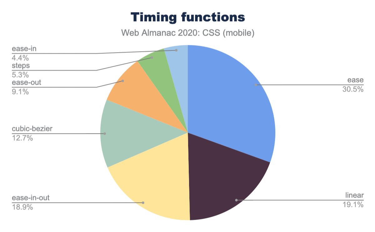
The specification authors got it right! Ease is the most popular timing function specified, even though it is the default so it can actually be omitted. Perhaps people explicitly specify the defaults because they prefer the self-documenting verbosity, or—perhaps more likely—because they don’t know that they are defaults. Despite the drawbacks of linearly progressing animation (it tends to look dull and unnatural), linear is the second most highly used timing function with 19.1%. It is also interesting that the built-in easing functions accommodate over 87% of all transitions: only 12.7% chose to specify a custom easing via cubic-bezier().
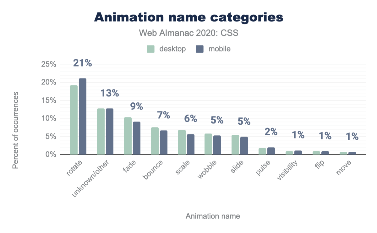
ease at 31% of occurrences, followed by linear at 19%, ease-in-out at 19%, cubic-bezier at 13%, ease-out at 9%, steps at 5%, and ease-in at 4%.A major driver of animation adoption seems to be Font Awesome, as evidenced by the animation name fa-spin appearing in one out of four pages and thus topping the list of most popular animation names. While there are a wide variety of animation names, it appears that most of them fall into only a few basic categories, with one in five animations being some kind of spin. That may also explain the high percentage of linearly progressing transitions & animations: if we want a smooth perpetual rotation, linear is the way to go.
rotate, which makes up 21% of occurrences on mobile pages, followed by unknown/other at 13%, fade at 9%, bounce at 7%, scale at 6%, wobble and slide at 5%, pulse at 2%, and the rest at 1%: visibility, flip, and move.Visual effects
CSS also offers a huge variety of visual effects giving designers access to advanced design techniques built into browsers that can be accessed with small amounts of code.
Blend modes
Last year, 8% of pages were using blend modes. This year, adoption has increased significantly, with 13% of pages using blend modes on elements (mix-blend-mode), and 2% in backgrounds (background-blend-mode).
Filters
Adoption of filters has remained high, with the filter property making an appearance in 79.43% of pages. While at first this was quite exciting, a lot of it is likely to be old IE DX filters (-ms-filter), which shared the same property name. When we only took into account valid CSS filters that Blink recognizes, usage drops to 22% for mobile and 20% for desktop, with blur() being the most popular filter type, appearing in 4% of pages.
Another filter property, backdrop-filter, allows us to apply filters to only the area behind an element, which is incredibly useful for improving contrast on translucent backgrounds, and creating the elegant “frosted glass” effect we’ve come to know from many native UIs. While not nearly as popular as filter, we found backdrop-filter in 6% of pages.
The filter() function allows us to apply a filter only on a particular image, which can be extremely useful for backgrounds. Sadly, it is currently only supported by Safari. We did not find any usage of filter().
Masks
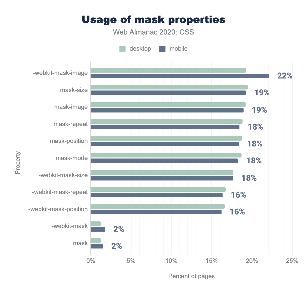
A decade ago, we got masks in Safari with -webkit-mask-image and it was exciting. Everyone and their dog were using them. We eventually got a spec and a set of unprefixed properties closely modeled after the WebKit prototype, and it seemed a matter of time until masking became standard, with a consistent syntax across all browsers. Fast forward 10 years later, and the unprefixed syntax is still not supported in Chrome or Safari, meaning its available on less than 5% of users’ browsers worldwide. It is therefore no surprise that -webkit-mask-image is still more popular than its standard counterpart, being found in 22% of pages. However, despite its very poor support, mask-image is found on 19% of pages. We see a similar pattern across most other masking properties with the unprefixed versions appearing in almost as many pages as the -webkit- ones. Overall, despite them falling out of hype, masks are still found in nearly a quarter of the web, indicating that the use cases are still there, despite lack of implementer interest (hint, hint!).
-webkit-mask-image is used on 22% of mobile pages, up from 19% on desktop. The following properties are mask-size and mask-image at 19%, mask-repeat, mask-position, mask-mode, and -webkit-mask-size at 18%, -webkit-mask-repeat and -webkit-mask-position at 16%, and -webkit-mask and mask properties at 2% of mobile pages.Clipping paths
Around the same time masks got popular, another similar but simpler property (originally from SVG) started making the rounds: clip-path. However, unlike masks, it had a brighter fate. It got standardized fairly quickly, and got support across the board relatively fast, with the last holdout being Safari which dropped the prefix in 2016. Today, it is found on 19% of pages unprefixed and 13% with the -webkit- prefix.
Responsive design
Making sites that cope with the many different screen sizes and devices that browse the web has become somewhat easier with the built-in flexible and responsive new layout methods such as Flexbox and Grid. These layout methods are usually further enhanced with the use of media queries. The data shows that 80% of desktop sites and 83% of mobile sites use media queries that are associated with responsive design, such as min-width.
Which media features are people using?
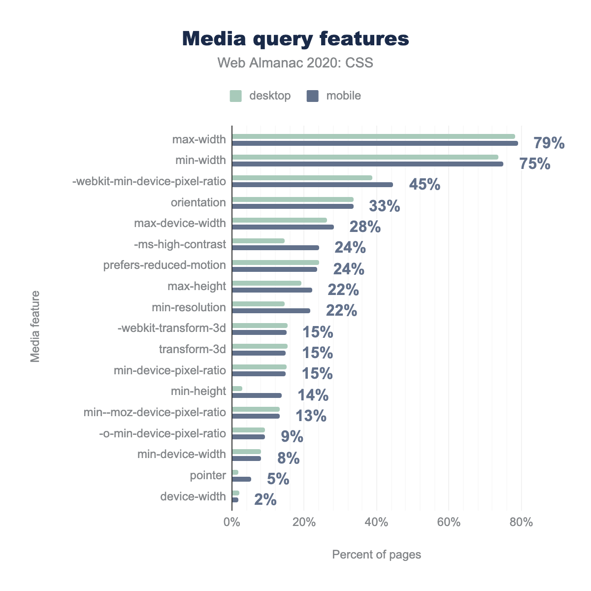
As you might expect, the most common media features in use are the viewport size features which have been in use since the early days of responsive web design. The percentage of sites checking for max-width is 78% for both desktop and mobile. A check for min-width features on 75% of mobile and 73% of desktop sites.
The orientation media feature, which allows authors to differentiate their layout based on whether the screen is portrait or landscape, can be found on 33% of all sites.
We are seeing some newer media features come up in the statistics. The prefers-reduced-motion media feature provides a way to check if the user has requested reduced motion, so that websites can adjust the amount of animation they use. This can be turned on either explicitly, through a user-controlled operating system setting, or implicitly, for example due to decreasing battery level. 24% of sites are checking for this feature.
In other good news, newer features from the Media Queries Level 4 specification are starting to appear. On mobile 5% of sites are checking for the type of pointer the user has. A coarse pointer indicates they are using a touchscreen, whereas a fine pointer indicates a pointing device. Understanding the way a user is interacting with your site is often just as helpful, if not more helpful, than looking at screen size. A person might be using a small screen device with a keyboard and mouse, or a high resolution large screen device with a touchscreen and benefit from larger hit areas.
max-width at 79%, followed by min-width at 75%, -webkit-min-device-pixel-ratio at 45% (up from desktop at 39%), orientation at 33%, max-device-width at 28%, -ms-high-contrast at 24% (up from desktop at 15%), prefers-reduced-motion at 24%, max-height and min-resolution at 22%, -webkit-transform-3d, transform-3d, and min-device-pixel-ratio all at 15%, min-height used on 14% of mobile pages but only 3% of desktop pages, -o-min-device-pixel-ratio at 8%, pointer at 5%, and finally device-width at 2%.Common breakpoints
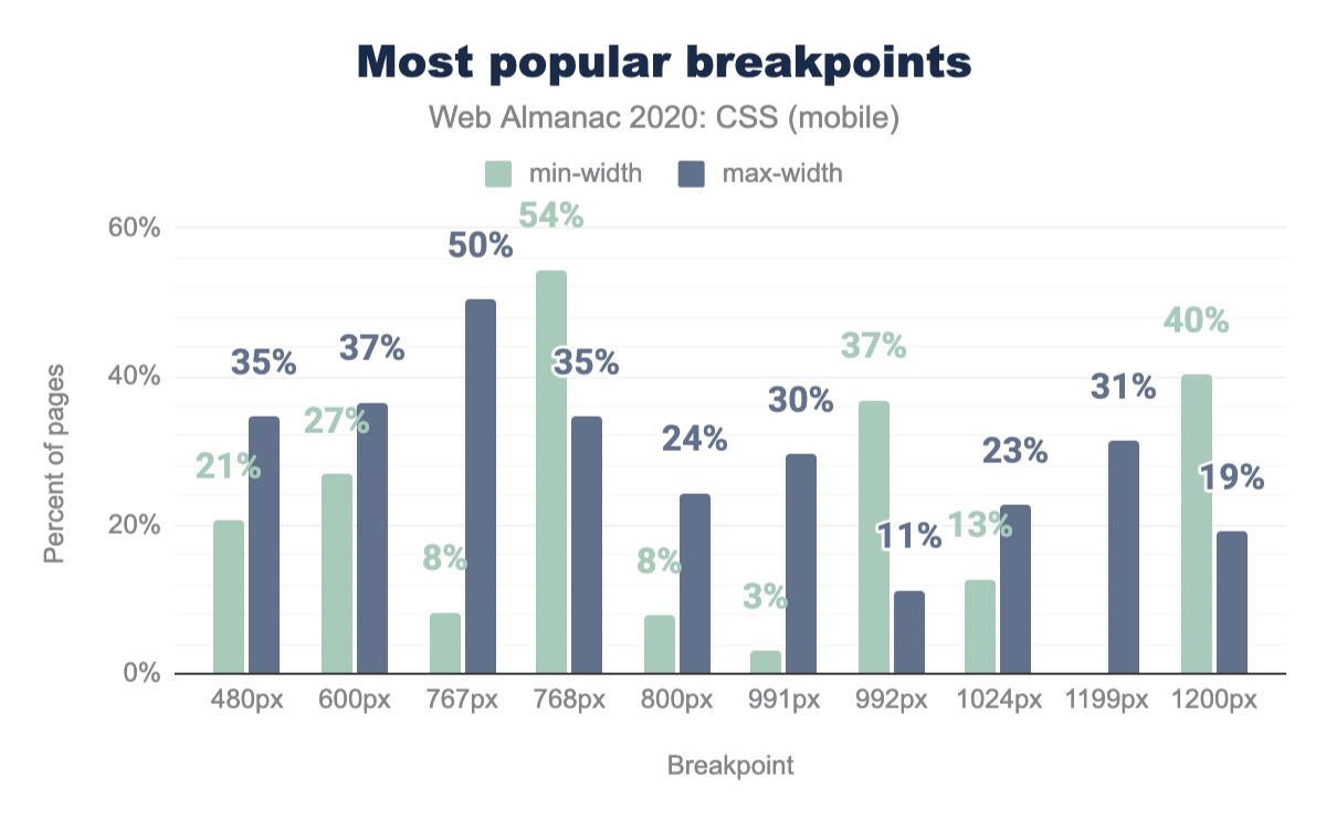
The most common breakpoint in use across desktop and mobile devices is a min-width of 768px. 54% of sites use this breakpoint, closely followed by a max-width of 767px at 50%. The Bootstrap framework uses a min-width of 768px as its “Medium” size, so this may be the source of much of the usage. The other two high-ranking min-width values of 1200px (40%) and 992px (37%) are also found in Bootstrap.
min-width and max-width as a percent of mobile pages. 480px is used as a min-width on 21% of mobile pages and as a max-width on 35%. 600px on 27% and 37% for min and max widths respectively, 767px on 8% and 50%, 768px on 54% and 35%, 800px on 8% and 24%, 991px on 3% and 30%, 992px on 37% and 11%, 1024px on 13% and 23%, 1199px on just 31% as a max-width, and 1200px on 40% and 19%.min-width and max-width as a percent of mobile pages.
Pixels are very much the unit that is used for breakpoints. There are a few instances of ems a long way down the list, however setting breakpoints in pixels appears to be the popular choice. There are probably many reasons for this. Legacy: all of the early articles on responsive design use pixels, and many people still think about targeting particular devices when creating responsive designs. Sizing: using ems involves considering the size of the content rather than the device, and this is a newer way of thinking about web design, perhaps one yet to fully be taken advantage of along with intrinsic sizing methods for layout.
Properties used inside media queries
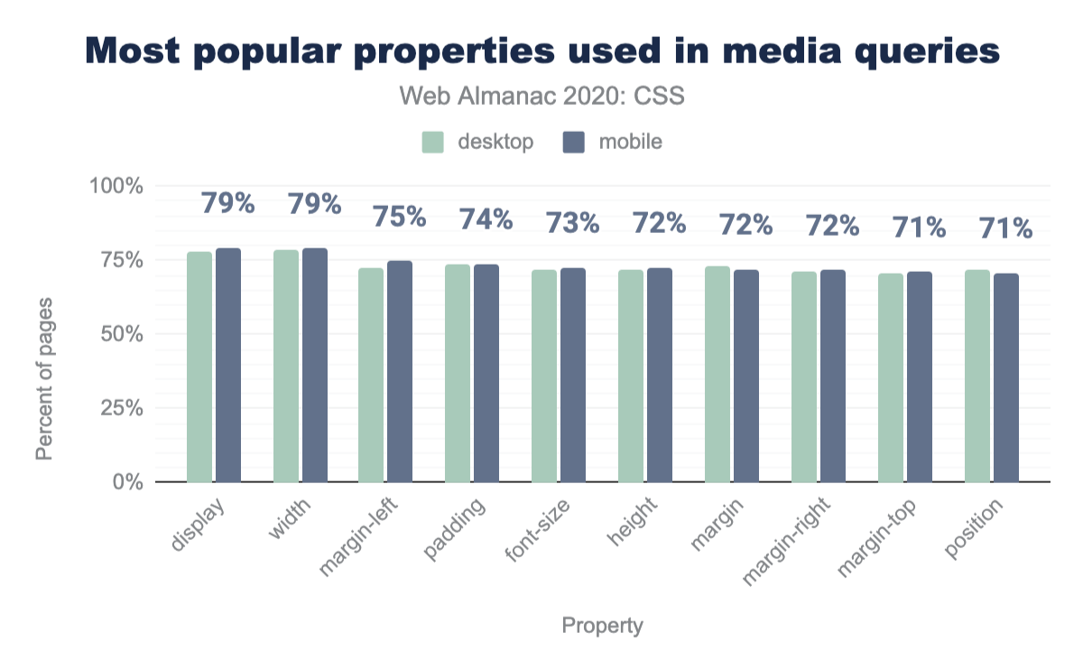
On mobile devices 79% and on desktop 77% of media queries are used to change the display property. Perhaps indicating that people are testing before switching to a Flex or Grid formatting context. Again, this may be linked frameworks, for example the Bootstrap responsive utilities. 78% of authors change the width property inside media queries, margin, padding and font-size all rank highly for changed properties.
display, width, margin-left, padding, font-size, height, margin, margin-right, margin-top, and position, in that order.Custom properties
Last year, only 5% of websites were using custom properties. This year, adoption has skyrocketed. Using last year’s query (which only counted declarations that set custom properties), usage has quadrupled on mobile (19.29%) and tripled on desktop (14.47%). However, when we look at values that reference custom properties via var(), we get an even better picture: 27% of mobile pages and 22% of desktop pages were using the var() function at least once, which indicates there is a sizeable number of pages only using var() to offer customization hooks, without ever setting a custom property.
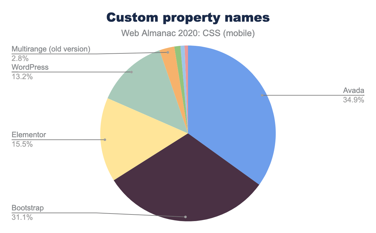
While at first glance this is impressive adoption, it appears that a major driver is WordPress, as evidenced by the most popular custom property names, the top 4 of which ship with WordPress.
Naming
Out of the 1,000 top property names, fewer than 13 are “custom”, as in made up by individual web developers. The vast majority are associated with popular software, such as WordPress, Elementor, and Avada. To determine this, we took into account not only which custom properties appear in what software (by searching on GitHub), but also which properties appear in groups with similar frequencies. This does not necessarily mean that the main way a custom property ends up on a website is through usage of that software (people do still copy and paste!), but it does indicate there aren’t many organic commonalities between the custom properties that developers define. The only custom property names that seem to have organically made the list of top 1000 are --height, --primary-color, and --caption-color.
Usage by type
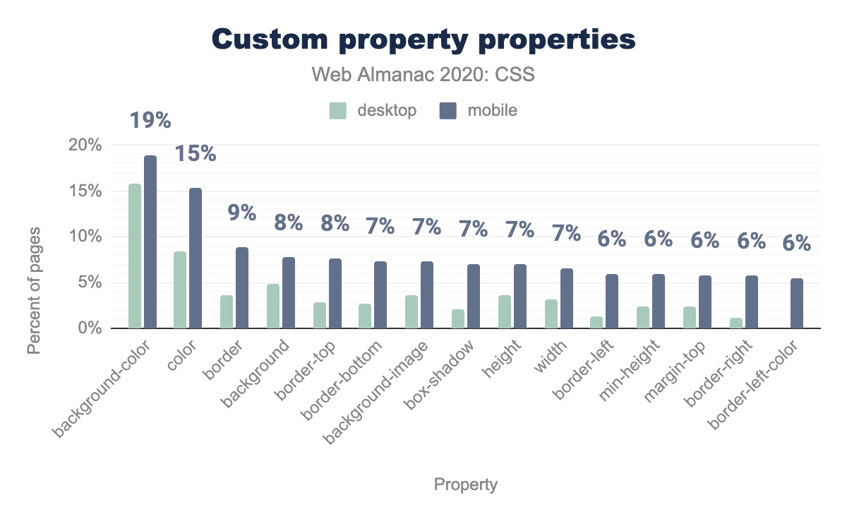
The biggest usage of custom properties appears to be naming colors and keeping colors consistent throughout. Approximately 1 in 5 desktop pages and 1 in 6 mobile pages uses custom properties in background-color, and the top 11 properties that contain var() references are either color properties or shorthands that contain colors. Lengths is the second biggest usage, with width and height being used with var() in 7% of mobile pages (interestingly, only around 3% of desktop pages). This is also confirmed by the types of most popular values, with color values accounting for 52% of all custom property declarations. Dimensions (a number + a unit, e.g. lengths, angles, times etc.) were the second more popular type, higher than unitless numbers (12%). This is despite guidance to prefer the latter, since numbers can be converted to dimensions via calc() and multiplication, but dimensions cannot be converted to numbers as dividing with dimensions is not supported yet.
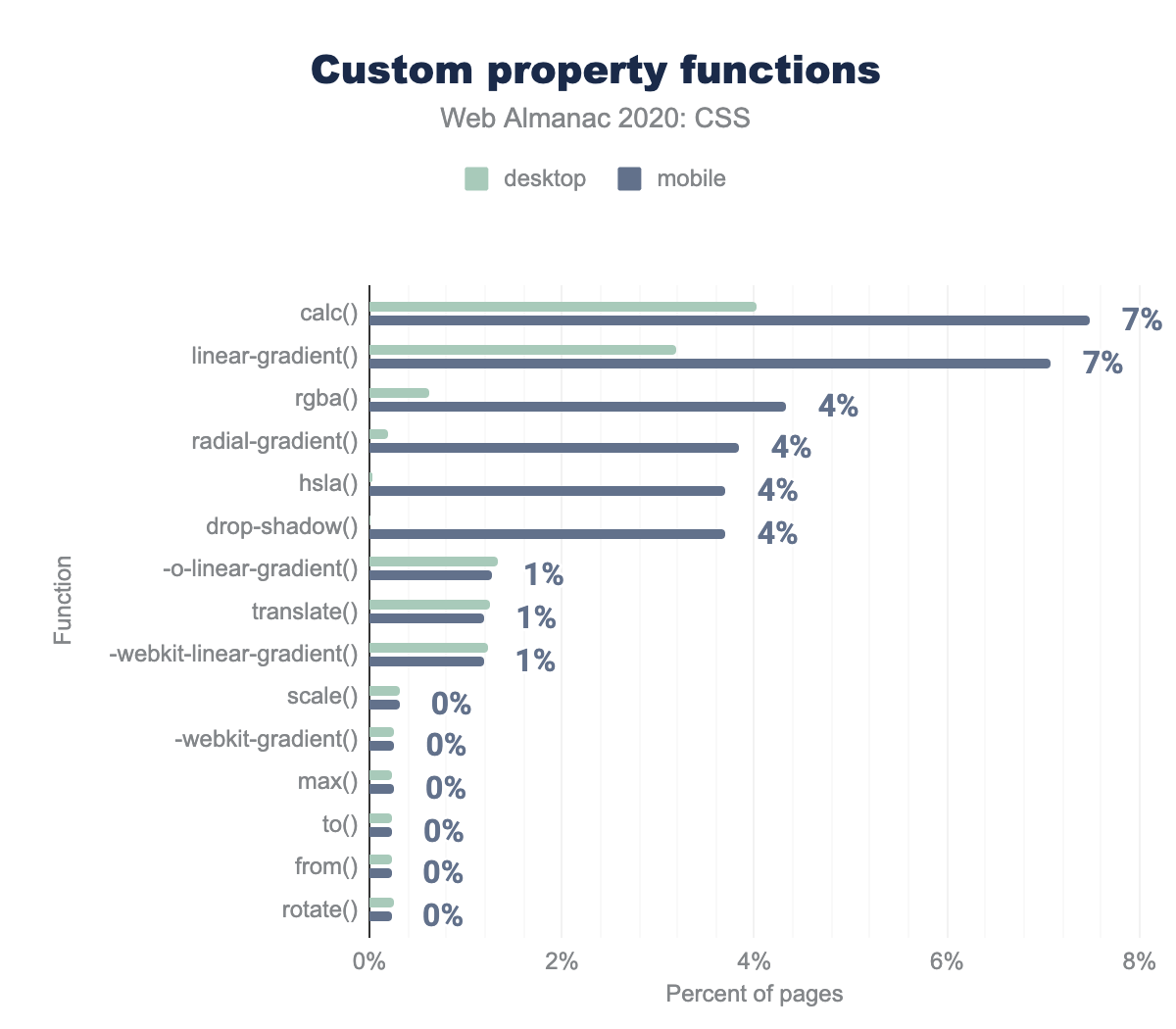
background-color and color on 19% and 15% of mobile pages respectively. The remaining properties use custom properties from 9% to 6% in descending order: border, background, border-top, border-bottom, background-image, box-shadow, height, width, border-left, min-height, margin-top, border-right, and border-left-color. Desktop adoption is about 4 percentage points smaller.In preprocessors, color variables are often manipulated to generate color variations, such as different tints. However, in CSS color modification functions are merely an unimplemented draft. Right now, the only way to generate new colors from variables is to use variables for individual components and plug them into color functions, such as rgba() and hsla(). However, fewer than 4% of mobile pages and 0.6% of desktop pages do that, indicating that the high usage of color variables is primarily to hold entire colors, with variations thereof being separate variables instead of dynamically generated.
calc (7%), linear-gradient, rgba (4%), radial-gradient, hsla, and drop-shadow. The following functions have 1% adoption on desktop and mobile pages: -o-linear-gradient, translate, and -webkit-linear-gradient. And finally these functions have approximately 0% adoption on desktop and mobile pages: scale, -webkit-gradient, max, to, from, and rotate.Complexity
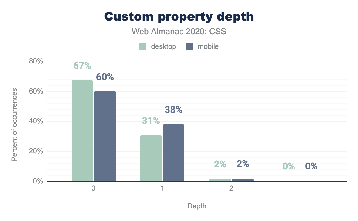
Next, we looked at how complex custom property usage is. One way to assess code complexity in software engineering is the shape of the dependency graph. We first looked at the depth of each custom property. A custom property set to a literal value like e.g. #fff has a depth of 0, whereas a property referencing that via var() would have a depth of 1 and so on. For example:
:root {
  --base-hue: 335; /* depth = 0 */
  --base-color: hsl(var(--base-hue) 90% 50%); /* depth = 1 */
  --background: linear-gradient(var(--base-color), black); /* depth = 2 */
}
2 out of 3 custom properties examined (67%) had a depth of 0, and 30% had a depth of 1 (slightly less on mobile). Less than 1.8% had a depth of 2, and virtually none (0.7%) had a depth of 3+, which indicates rather basic usage. The upside of such basic usage is that it is harder to make mistakes: fewer than 0.5% of pages included cycles.
Examining the selectors on which custom properties are declared further confirms that most custom property usage in the wild is fairly basic. Two out of three custom property declarations are on the root element, indicating that they are used essentially as global constants. It is important to note that many popular polyfills have required them to be global in this vein, so developers using said polyfills may not have had a choice.
CSS and JS
The last few years has seen a greater interaction between CSS and JavaScript, beyond the simple setting of CSS classes and styles or off. So how much are we using technologies like Houdini and techniques like CSS-in-JS?
Houdini
You have likely heard of Houdini by now. Houdini is a set of low-level APIs that exposes parts of the CSS engine, giving developers the power to extend CSS by hooking into the styling and layout process of a browser’s rendering engine. Since several Houdini specs have shipped in browsers, we figured it is time to see if they are actually used in the wild yet. Short answer: no. And now for the longer answer…
First, we looked at the Properties & Values API, which allows developers to register a custom property and give it a type, an initial value, and prevent it from being inherited. One of the primary use cases is being able to animate custom properties, so we also looked at how frequently custom properties are being animated.
As is common with bleeding edge tech, especially when not supported in all browsers, adoption in the wild has been extremely low. Only 32 desktop and 20 mobile pages were found to have any registered custom properties, though this excludes custom properties that were registered but were not being applied at the time of the crawl. Only 325 mobile pages and 330 desktop ones (0.00%) use custom properties in animations, and most (74%) of that seems to be driven by a Vue component. Virtually none of those appear to have registered them, though this is likely because the animation wasn’t active at the time of the crawl, so there was no computed style needing to be registered.
The Paint API is a more broadly implemented Houdini spec which allows developers to create custom CSS functions that return <image> values, e.g. to implement custom gradients or patterns. Only 12 pages were found to be using paint(). Each worklet name (hexagon, ruler, lozenge, image-cross, grid, dashed-line, ripple) only appeared on one page each, so it appears the only in-the-wild use cases were likely demos.
Typed OM, another Houdini specification, allows access to structured values instead of the strings of the classic CSS OM. It appears to have considerably higher adoption compared to other Houdini specs, though still low overall. It is used in 9,864 desktop pages (0.18%) and 6,391 mobile ones (0.1%). While this may seem low, to put it in perspective, these are similar numbers to the adoption of <input type="date">! Note that unlike most stats in this chapter, these numbers reflect actual usage, and not just inclusion in a website’s assets.
CSS-in-JS
There is so much discussion (or argument) about CSS-in-JS that one could assume everyone and their dog is using it.
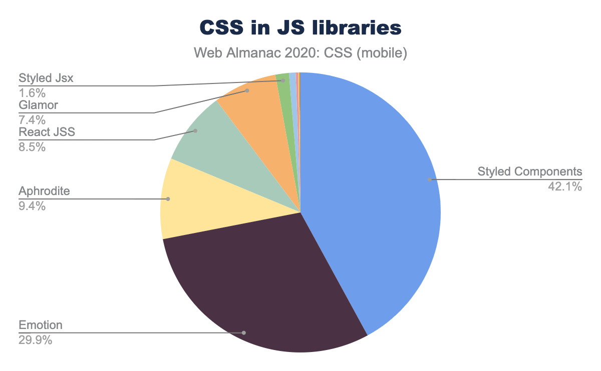
However, when we looked at usage of various CSS-in-JS libraries, it turned out that only about 2% of websites use any CSS-in-JS method, with Styled Components accounting for almost half of that.
Internationalization
English, like many languages, is written in horizontal lines and the characters are laid out from left to right. But some languages (such as Arabic and Hebrew) are mostly written right to left and then there are languages which may be written in vertical lines, from top to bottom. Not to mention quotations from other languages. So things can get quite complicated. Both HTML and CSS have ways to handle this.
Direction
When text is presented in horizontal lines, most writing systems display characters from left to right. Urdu, Arabic and Hebrew display characters from right to left, except for numbers, which are written from left to right; they are bidirectional. Some characters—such as brackets, quote marks, punctuation—could be used in either a left to right or a right to left context and are said to be directionally neutral. Things get more complex when text strings of different languages are nested in one another—English text containing a short quote in Hebrew which contains some English words, for example. The Unicode bidirectional algorithm defines how to lay out paragraphs of mixed-direction text, but it needs to know the base direction of the paragraph.
To support bidirectionality, explicit support for indicating direction is available in both HTML via (the dir attribute and the <bdo> element), and CSS (the direction and unicode-bidi properties. We looked at usage of both HTML and CSS methods.
Only 12.14% of pages on mobile (and a similar 10.76% on desktop) set the dir attribute on the <html> element. Which is fine: most writing systems in the world are ltr, and the default dir value is ltr. Of the pages which did set dir on <html>, 91% set it to ltr while 8.5% set it to rtl and 0.32% to auto (the explicit direction is unknown value, mainly useful for templates which will be filled with unknown content). An even smaller number, 2.63%, set dir on <body> than on the <html>. Which is good, because setting it on <html> also covers you for content in the <head>, like <title>.
Why set direction using HTML attributes rather than CSS styling? One reason is separation of concerns: direction has to do with content which is the purview of HTML. It is also the recommended practice: Avoid using CSS or Unicode control codes for managing direction where you can use markup
. After all, the stylesheet might not load, and the text still needs to be readable.
Logical vs physical properties
Many of the first properties we are taught when we learn CSS, things like width, height, margin-left, padding-bottom, right and so on are grounded on a specific physical direction. However, when content needs to be presented in multiple languages with different directionality characteristics, these physical directions are often language dependent, e.g. margin-left often needs to become margin-right in a right-to-left language such as Arabic. Directionality is a 2D characteristic. For example, height may need to become width when we are presenting content in vertical writing (such as traditional Chinese).
In the past, the only solution to these problems was a separate stylesheet with overrides for different writing systems. However, more recently CSS has acquired logical properties and values that work just like their physical counterparts but are sensitive to the directionality of their context . For example, instead of width we could write inline-size, and instead of left we could use the inset-inline property. In addition to logical properties, there are also logical keywords, such as float: inline-start instead of float: left.
While these properties are fairly well supported (with some exceptions), they are not used very much outside of user agent stylesheets. None of the logical properties were used on more than 0.6% of pages. Most usage was to specify margins and paddings. Logical keywords for text-align were used on 2.25% of pages, but apart from that, none of the other keywords were even encountered at all. This is by large driven by browser support: text-align: start and end have fairly good browser support whereas logical keywords for clear and float are only supported in Firefox.
Browser support
A perennial problem with the web platform is how to introduce new features and extend the platform. CSS has seen us moving from vendor prefixes to feature queries as a better way of introducing change so we wanted to look at how those two techniques were being used.
Vendor prefixes
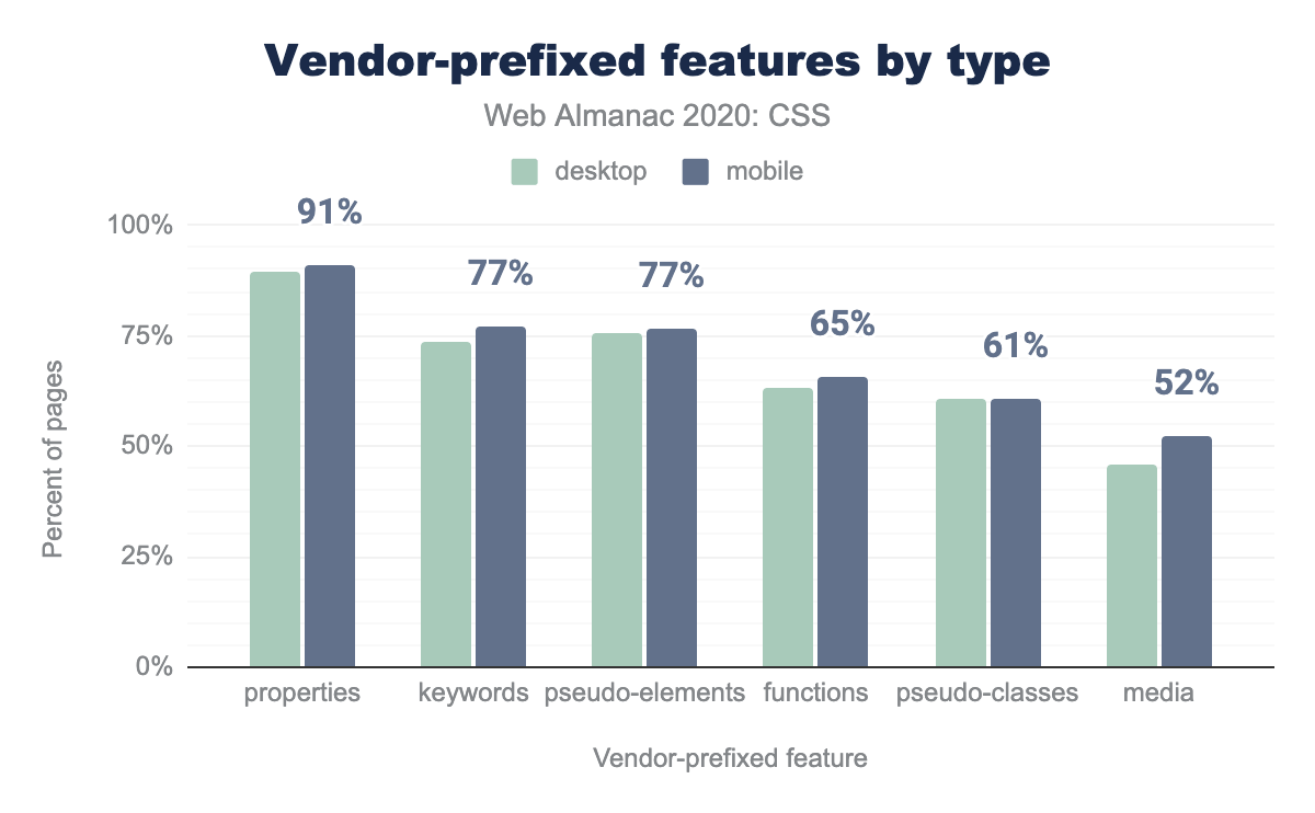
Even though prefixing is now recognized as a failed way to introduce experimental features to developers, and browsers have largely stopped using it, opting for flags instead, a whopping 91% of pages still use at least one prefixed feature.
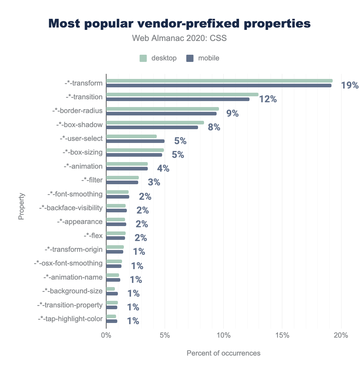
Prefixed properties take up the lion’s share of that, since 84% of all prefixed features used were properties and these were used on 90.76% of mobile pages, and 89.66% of desktop pages. This is most likely a remnant of the prefix-happy CSS3 era circa 2009-2014. This is also evident from the most popular prefixed ones, none of which have actually needed prefixes since 2014:
transform property makes up 19% of vendor prefix usage, followed by 12% transition, 9% border-radius, 8% box-shadow, 5% user-select and box-sizing, 4% animation, 3% filter, 2% each of font-smoothing, backface-visibility, appearance, and flex, and 1% usage for the remaining properties: transform-origin, osx-font-smoothing, animation-name, background-size, transition-property, and tap-highlight-color.Some of these prefixes, like -moz-border-radius, haven’t been useful since 2011. Even more mind-boggling, other prefixed properties that never existed, are still moderately common, with roughly 9% of all pages including -o-border-radius!
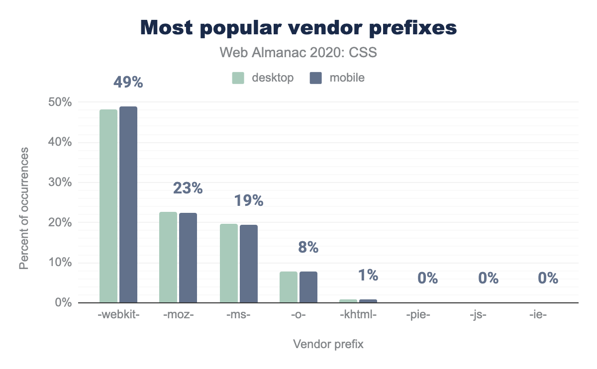
It may come as no surprise that -webkit- is by far the most popular prefix, with half of prefixed properties using it:
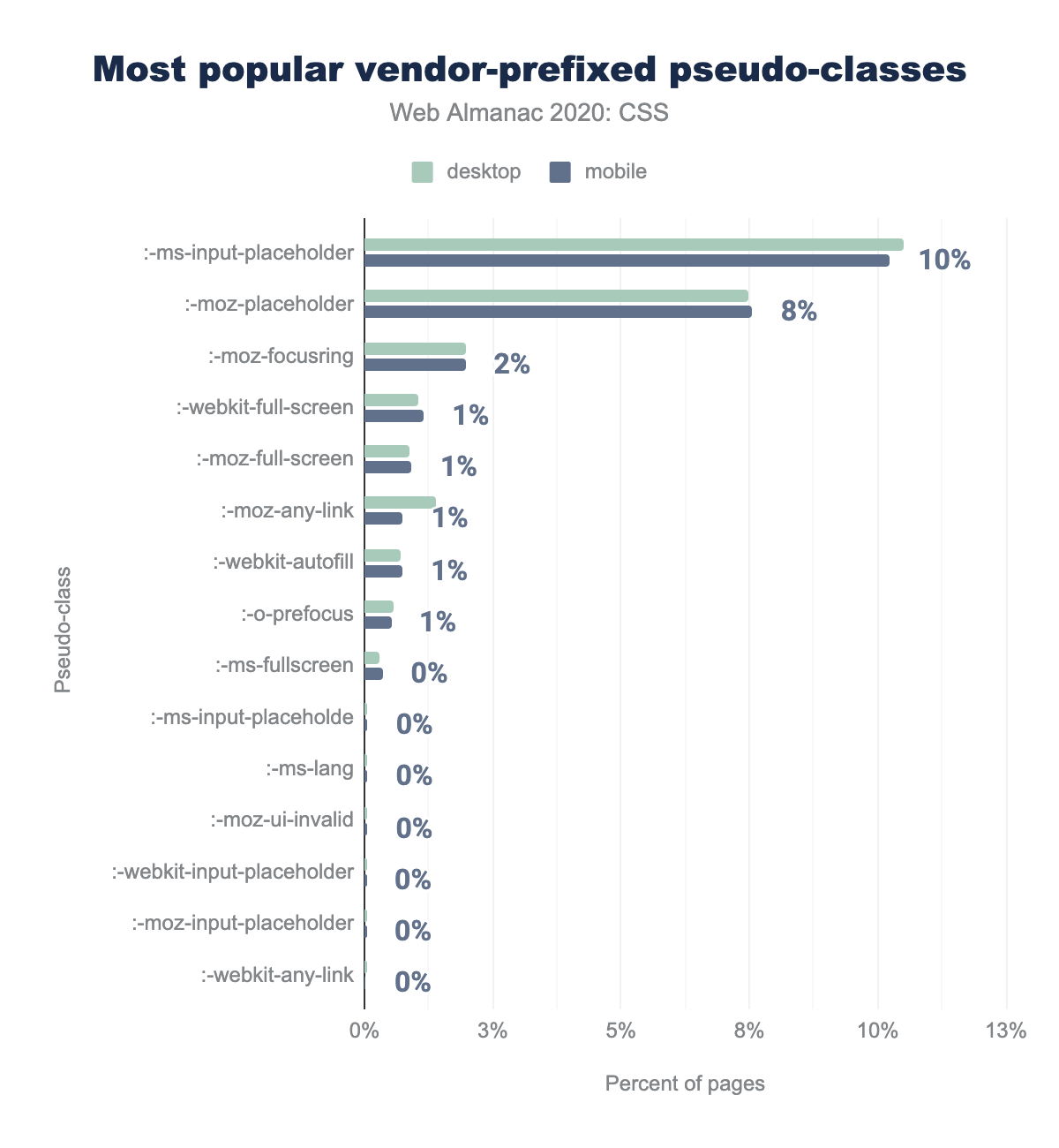
-webkit makes up 49% of vendor prefix usage on mobile pages, -moz 23%, -ms 19%, -o 8%, -khtml 1%, and 0% for -pie, -js, and -ie. Desktop is similar.Prefixed pseudo-classes are not nearly as common as properties, with none of them being used in more than 10% of pages. Nearly two thirds of all prefixed pseudo-classes overall are for styling placeholders. In contrast, the standard :placeholder-shown pseudo-class is barely used, encountered in less than 0.34% of pages.
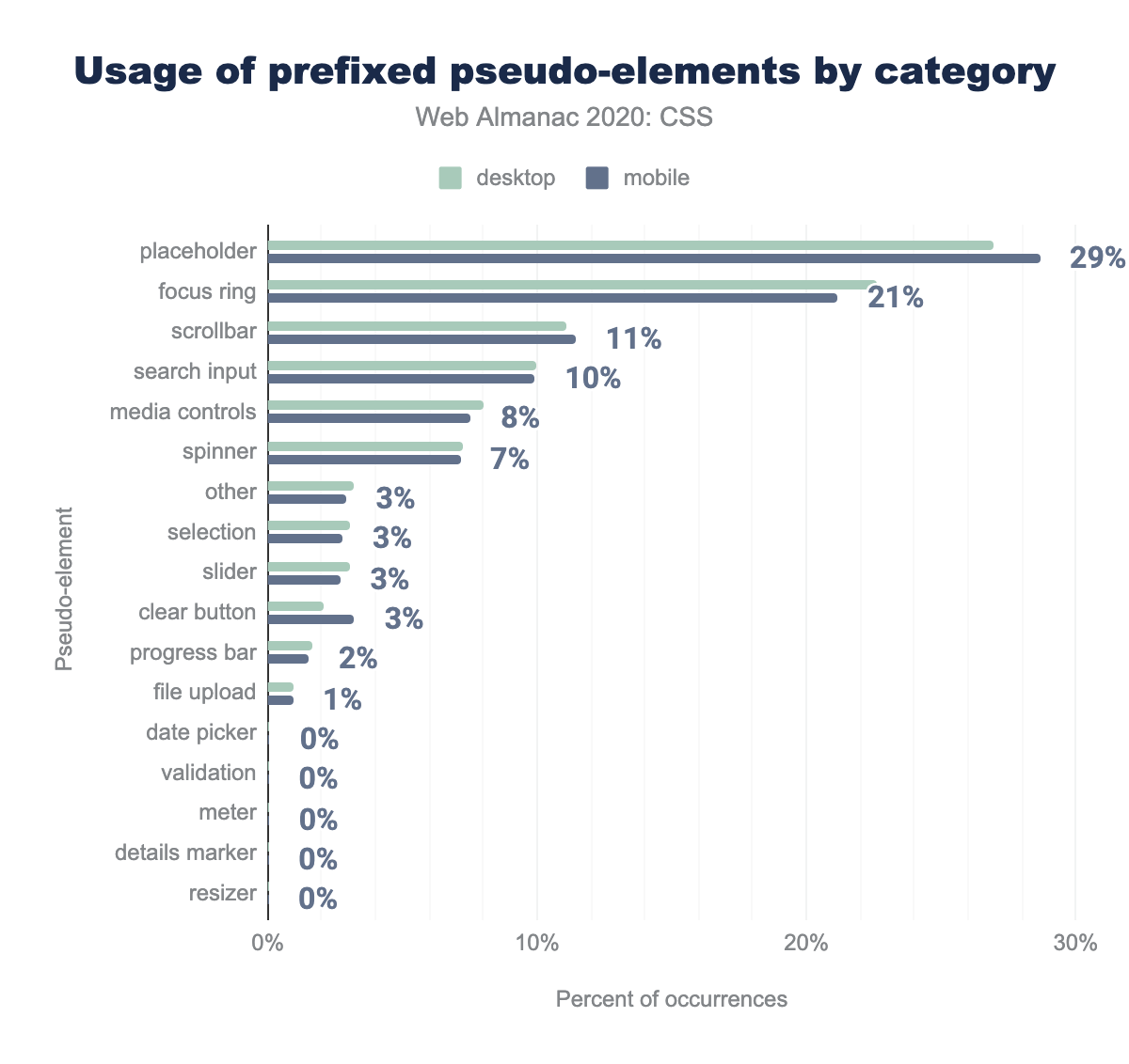
:ms-input-placeholder is used on 10% of mobile pages, :-moz-placeholder 8%, :-mox-focusring 2%, and 1% or less for the following: :-webkit-full-screen, :-moz-full-screen, :-moz-any-link, :-webkit-autofill, :-o-prefocus, :-ms-fullscreen, :-ms-input-placeholder [sic], :-ms-lang, :-moz-ui-invalid, :-webkit-input-placeholder, :-moz-input-placeholder, and :-webkit-any-link.The most common prefixed pseudo-element is ::-moz-focus-inner, used to disable Firefox’s inner focus ring. It makes up almost a quarter of prefixed pseudo-elements and for which there is no standard alternative. Another quarter of prefixed pseudo-elements is yet again for styling placeholders, while the standard version, ::placeholder, trails far behind, used in only 4% of pages.
The remaining half of prefixed pseudo-elements is primarily devoted to styling scrollbars and Shadow DOM of native elements (search inputs, video & audio controls, spinner buttons, sliders, meters, progress bars). This indicates a strong developer need for customization of built-in UI controls, for which standards-compliant CSS still falls short, although there are multiple ongoing CSS WG discussions to ameliorate that.
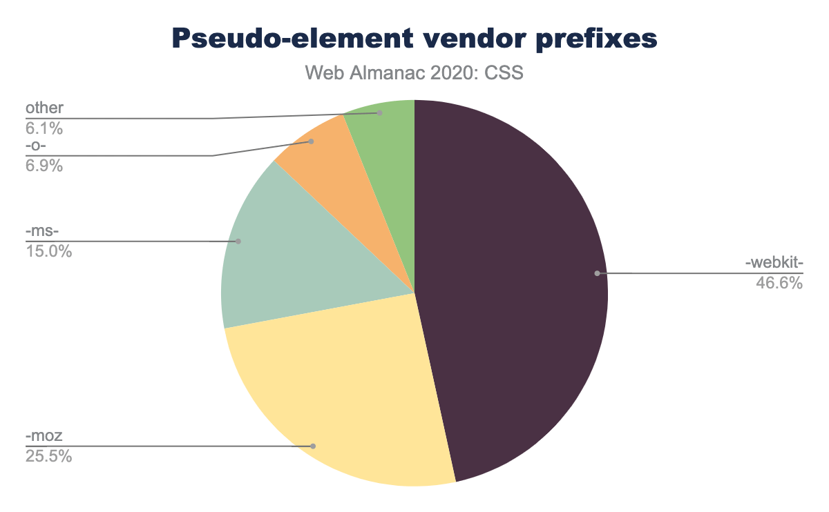
It is no secret that Chrome and Safari have been way more prefix-happy, but it is especially true with pseudo-elements: nearly half of all prefixed pseudo-elements we found had a -webkit- prefix.
-webkit makes up 47% of pseudo-element vendor prefix usage, followed by, 26% -moz, 15% -ms, 7% -o, and 6% other.Nearly all usage of prefixed functions (98%) is to specify gradients, even though this has not been necessary since 2014. The most popular of these is -webkit-linear-gradient() used in over a quarter of pages examined. The remaining <2% is primarily for calc, for which a prefix has not been necessary since 2013.
Usage of prefixed media features is lower overall, with the most popular one, -webkit-min-pixel-ratio used in 13% of pages to detect “Retina” displays. The corresponding standard media feature, resolution has finally surpassed it in popularity and is used in 22% of mobile pages and 15% desktop pages.
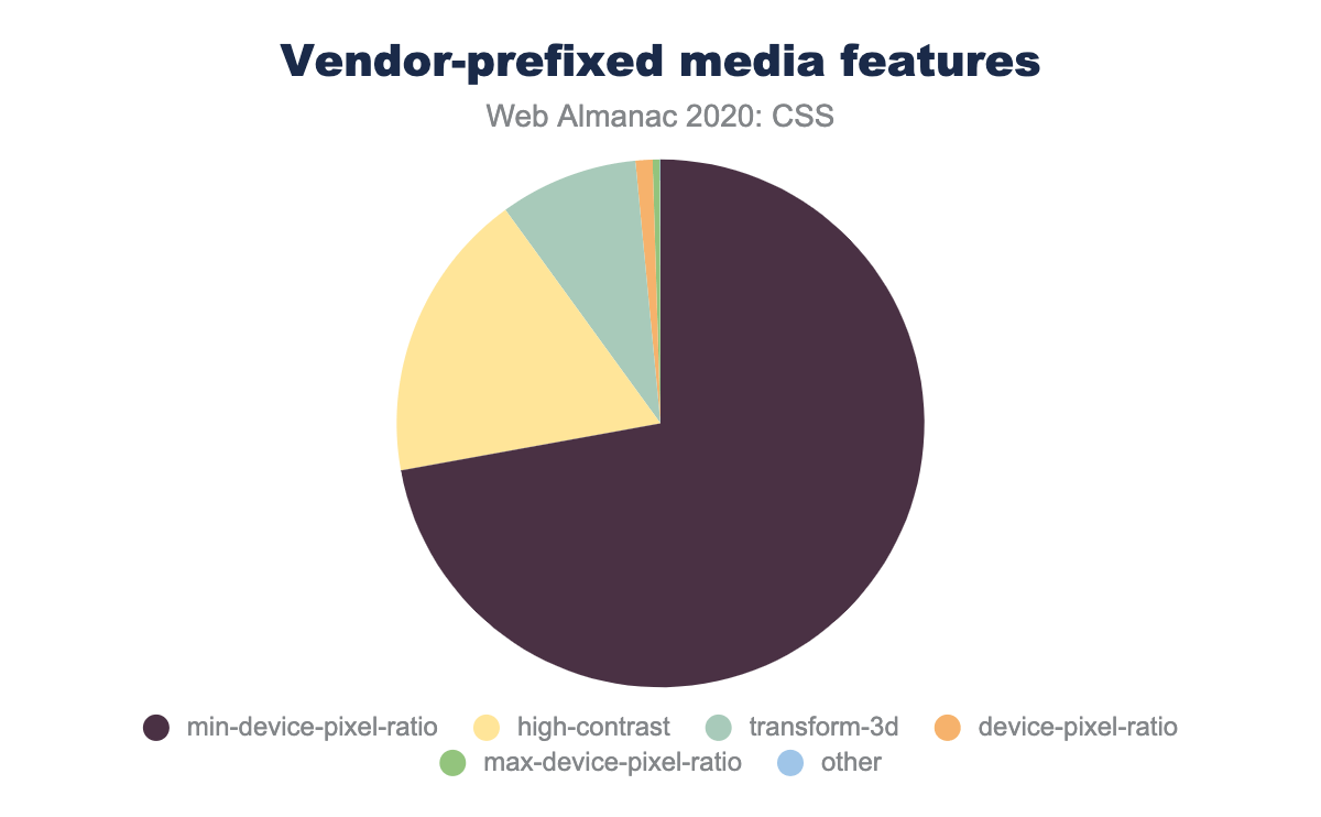
Overall, -*-min-pixel-ratio comprises three quarters of prefixed media features on desktop and about half on mobile. The reason for the difference is not reduced mobile usage, but that another prefixed media feature, -*-high-contrast, is far more popular on mobile making up almost the entire other half of prefixed media features, but only 18% on desktop. The corresponding standard media feature, forced-colors is still experimental and behind a flag in Chrome and Firefox and did not appear at all in our analysis.
min-device-pixel-ratio and high-contrast each make up 47% of occurrences, transform-3d at 5%, and the remaining features less than 1% are device-pixel-ratio, max-device-pixel-ratio, and other featuresFeature queries
Feature queries (@supports) have been steadily gaining traction for the past few years, and were used in 39% of pages, a notable increase from last year’s 30%.
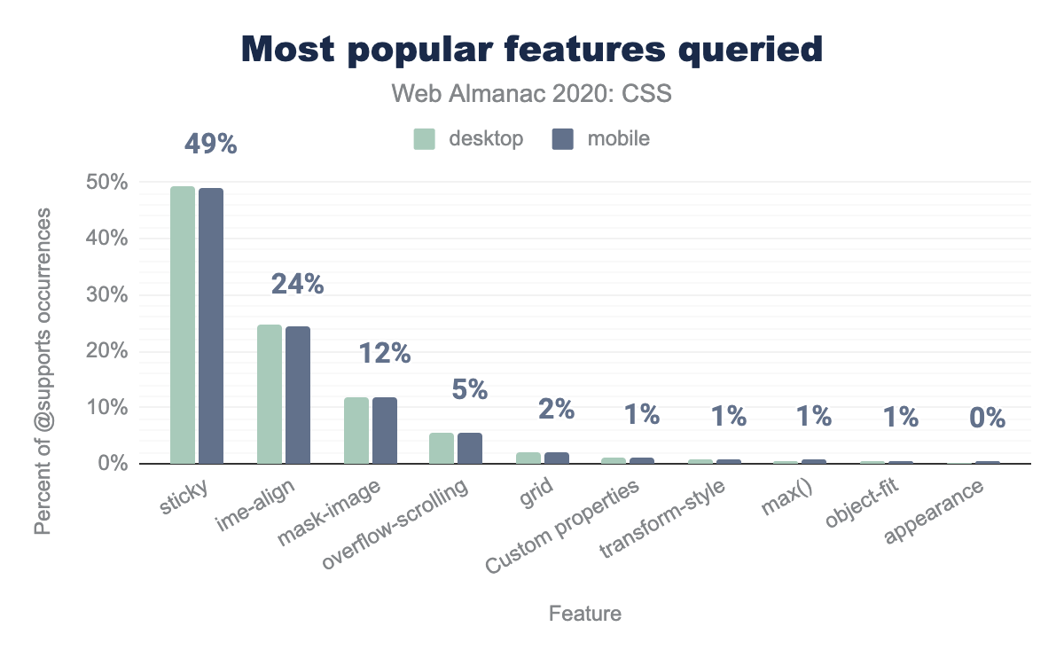
But what are they used for? We looked at the most popular queries. The results may come as a big surprise—it was to us! We expected Grid-related queries to top the list, but instead, the most popular feature queries by far are for position: sticky! They comprise half of all feature queries and are used in about a quarter of pages. In contrast, Grid-related queries account for only 2% of all queries, indicating that developers feel comfortable enough with Grid’s browser support that they don’t need to use it only as progressive enhancement.
What is even more mysterious is that position: sticky itself is not used as much as the feature queries about it, appearing in 10% of desktop pages and 13% of mobile pages. So there are over half a million pages that detect position: sticky without ever using it! Why?!
Lastly, it was encouraging to see max() already in the top 10 most detected features, appearing in 0.6% of desktop pages and 0.7% of mobile pages. Given that max() (and min(), and clamp()) was only supported across the board this year, it is quite impressive adoption and highlights how desperately developers needed this.
A small but notable number of pages (around 3000 or 0.05%) were oddly using @supports with CSS 2 syntax, such as display: block or padding: 0px, syntax that existed well before @supports was implemented. It is unclear what this was meant to achieve. Perhaps it was used to shield CSS rules from old browsers that don’t implement @supports?
sticky at 49% of occurrences on mobile pages, followed by ime-align at 24%, mask-image at 12%, overflow-scrolling at 5%, grid at 2%, custom properties, transform-style, max(), and object-fit all at 1%, and appearance at approximately 0%.@supports features queried as a percent of occurrences.
Meta
Up until now we’ve looked at what CSS developers have used, but in this section we want to look more about how they are using it.
Declaration repetition
To tell how efficient and maintainable a stylesheet is, one rough factor is declaration repetition, that is, the ratio between unique (different) and total number of declarations. The factor is a rough one because it is not trivial to normalize declarations (border: none, border: 0, even border-width: 0—plus a few more—are all different but say the same thing), and also because there are levels for the repetition: media query (most useful but harder to measure), stylesheet, or data set level as with the Almanac’s overall metrics.
We did look at declaration repetition and found that the median web page, on mobile, uses a total of 5,454 declarations, of which 2,398 are unique. The median ratio (which is based on the data set, not these two values) comes out at 45.43%. What this means is that on the median page, each declaration is used roughly two times.
| Percentile | Unique / Total |
|---|---|
| 10 | 30.97% |
| 50 | 45.43% |
| 90 | 63.67% |
These ratios are better, then, than what we know from scarce previous data. In 2017, Jens Oliver Meiert sampled 220 popular websites and came out with the following averages: 6,121 declarations, of which 1,698 were unique, and a unique/total ratio of 28% (median 34%). The topic could need further investigation, but from the little we know so far, declaration repetition is tangible—and may have either improved or be more of a problem for the more popular and likely larger sites.
Shorthands and longhands
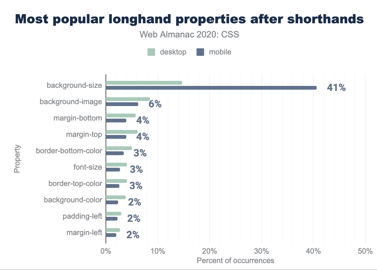
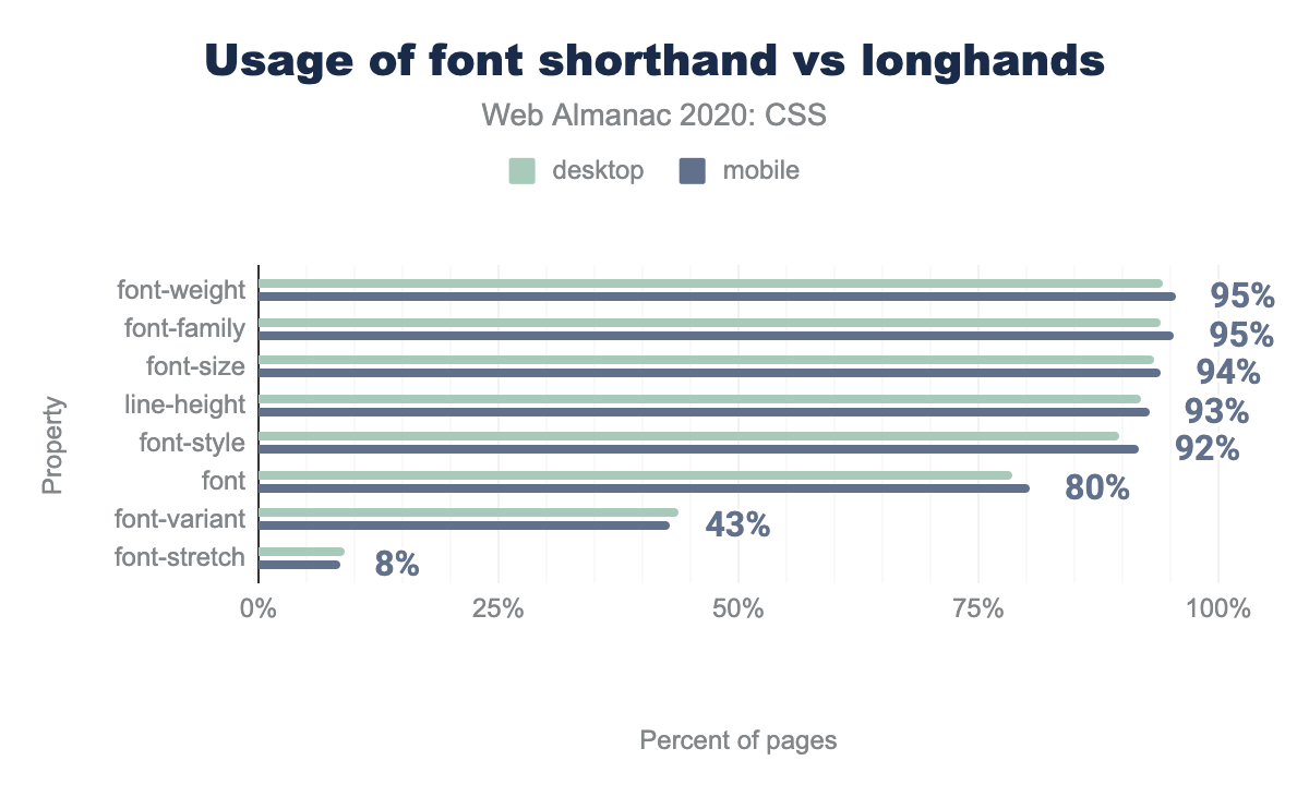
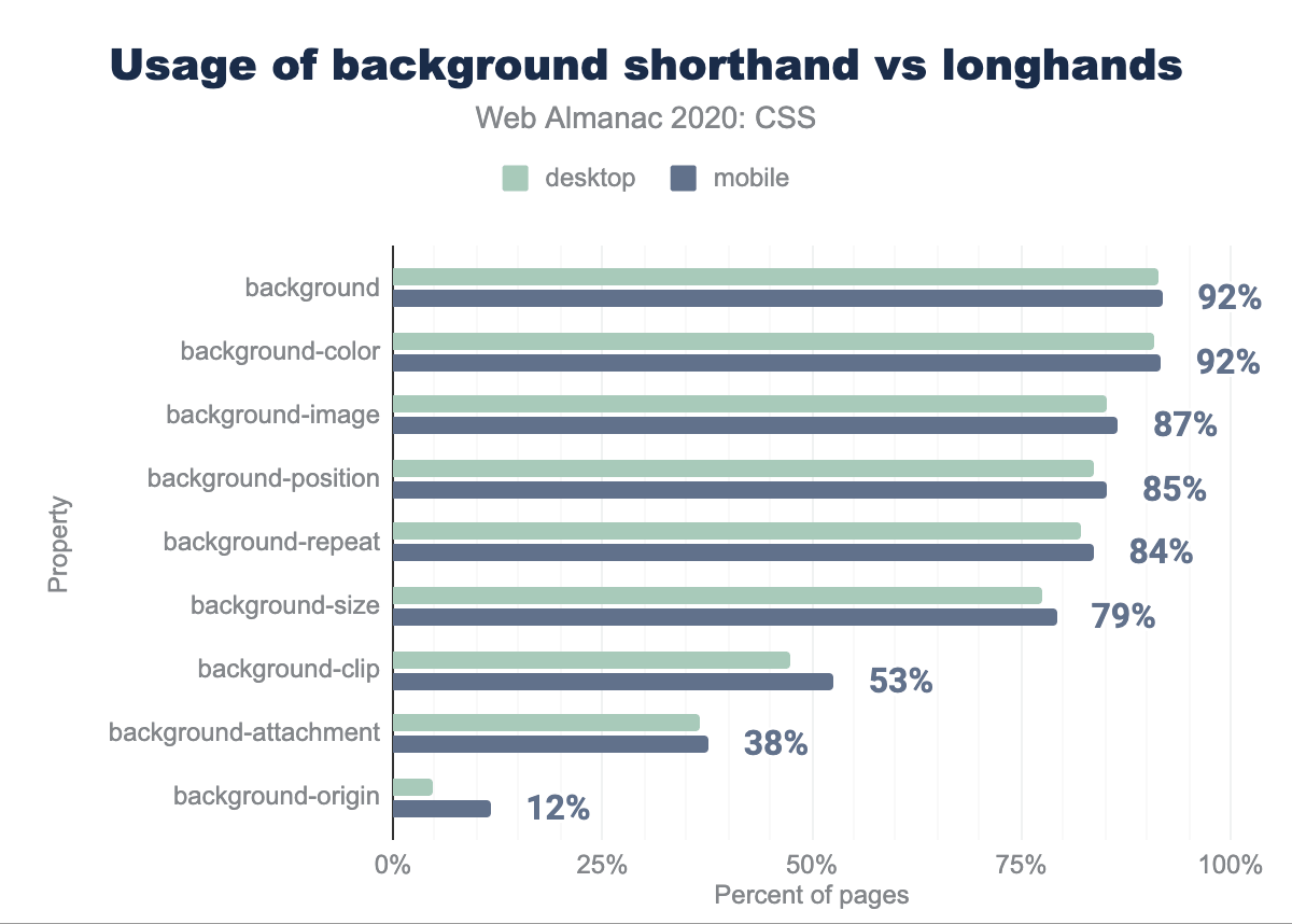
Some shorthands are more successful than others. Sometimes the shorthand is sufficiently easy to use and its syntax memorable, that we end up only using the longhands intentionally, when we want to override certain values independently. And then there are these shorthands that are hardly ever used because their syntax is too confusing.
Shorthands before longhands
Some shorthands are more successful than others. Sometimes the shorthand is sufficiently easy to use and its syntax memorable, that we end up only using the longhands intentionally, when we want to override certain values independently. And then there are these shorthands that are hardly ever used because their syntax is too confusing. Using a shorthand and overriding it with a few longhands in the same rule is a good strategy for a variety of reasons:
First, it is good defensive coding. The shorthand resets all its longhands to their initial values if they have not been explicitly specified. This prevents rogue values coming in through the cascade.
Second, it is good for maintainability, to avoid repetition of values when the shorthand has smart defaults. For example, instead of margin: 1em 1em 0 1em we can write:
margin: 1em;
margin-bottom: 0;
Similarly, for list-valued properties, longhands can help us reduce repetition when a value is the same across all list values:
background: url("one.png"), url("two.png"), url("three.png");
background-repeat: no-repeat;
Third, for cases where parts of the shorthand’s syntax are too weird, longhands can help improve readability:
/* Instead of: */
background: url("one.svg") center / 50% 50% content-box border-box;

/* This is more readable: */
background: url("one.svg") center;
background-size: 50% 50%;
background-origin: content-box;
background-clip: border-box;
So how frequently does this occur? Very, as it turns out. 88% of pages use this strategy at least once. By far, the most frequent longhand this happens with is background-size, accounting for 40% of all longhands that come after their shorthand, indicating that the slash syntax for background-size in background may not have been the most readable or memorable syntax we could have come up with. No other longhand comes close to this frequency. The remaining 60% is a long tail spread across many other properties evenly.
background-size at 15% for desktop and 41% for mobile, background-image at 8% and 6% respectively, margin-bottom at 6% and 4%, margin-top at 6% and 4%, border-bottom-color at 5% and 3%, font-size at 4% and 3%, border-top-color at 4% and 3%, background-color at 4% and 2%, padding-left at 3% and 2%, and finally margin-left at 3% and 2%.font
The font shorthand is fairly popular (used 49 million times on 80% of pages) but used far less than most of its longhands (except font-variant and font-stretch). This indicates that most developers are comfortable using it (since it appears on so many websites). Developers often need to override specific typographic aspects on descendant rules, which likely explains why the longhands are used so much more.
font shorthand and longhand properties.
background
As one of the oldest shorthands, background is also highly used, appearing 1 billion times in 92% of pages. it is used more frequently than any of its longhands except background-color, which is used 1.5 billion times, in roughly the same number of pages. However, this doesn’t mean developers are fully comfortable with all of its syntax: nearly all (>90%) of background usage is very simple, with one or two values, most likely colors and images or images and positions. For anything further, the longhands are seen as more self-explanatory.
background is 91% on desktop and 92% on mobile, background-color is 91% and 92% respectively, background-image is 85% and 87%, background-position is 84% and 85%, background-repeat is 82% and 84%, background-size is 77% and 79%, background-clip is 48% and 53%, background-attachment is 37% and 38%, background-origin is 5% on desktop and 12% on mobile.background shorthand and its longhands.
Margins and paddings
Both the margin and padding shorthands, as well as their longhands were some of the most highly used CSS properties. Padding is considerably more likely to be specified as a shorthand (1.5B uses for padding vs 300-400M for each shorthand), whereas there is less of a difference for margin (1.1B uses of margin vs 500-800M for each of its longhands). Given the initial confusion of many CSS developers about the clockwise order of values in these shorthands and the repetition rule for 2 or 3 values, we expected that most of these uses of the shorthands would be simple (1 value), however we saw the entire range of 1,2,3 or 4 values. Obviously 1 or 2 values were more common, but 3 or 4 were not at all uncommon, occurring in over 25% of margin uses and over 10% of padding usage.
padding is 93% on desktop, 94% on mobile, margin is 93% and 93% respectively, margin-left is 91% and 92%, margin-top is 90% and 91%, margin-right is 90% and 91%, margin-bottom is 90% and 91%, padding-left is 90% and 90%, padding-top is 88% and 89%, padding-bottom is 88% and 89%, and padding-right is 87% and 88%.margin & padding shorthands and their longhands.
Flex
Nearly all flex, flex-* properties are very highly used, appearing in 30-60% of pages. However, both flex-wrap and flex-direction are used far more than their shorthand, flex-flow. When flex-flow is used, it is used with two values, i.e. as a shorter way to set both of its longhands. Despite the elaborate sensible defaults for using flex with one or two values, around 90% of usage consists of the 3 value syntax, explicitly setting all three of its longhands.
flex-direction is 55% on desktop and 60% on mobile, flex-wrap is 55% and 58% respectively,flex is 52% and 56%, flex-grow is 44% and 52%,flex-basis is 40% and 44%,flex-shrink is 28% and 37%, flex-flow is 27% and 30%.Grid
Did you know that grid-template-columns, grid-template-rows, and grid-template-areas are actually shorthands of grid-template? Did you know that there’s a grid property and all of those are some of its longhands? No? Well, you’re in good company: neither do most developers. The grid property was only used in 5,279 websites (0.08%) and grid-template on 8,215 websites (0.13%). In comparison, grid-template-columns is used in 1.7 million websites, over 200 times more!
grid-template-columns is 27% on desktop and 26% on mobile, grid-template-rows is 24% and 24% respectively, grid-column is 20% and 20%, grid-row is 20% and 19%, grid-area is 6% and 6%, grid-template-areas is 6% and 6%, grid-gap is 4% and 5%, grid-column-gap is 4% and 3%, grid-row-gap is 3% and 3%, grid-column-end is 3% and 2%, grid-column-start is 3% and 2%, grid-row-start is 3% and 2%, grid-row-end is 2% and 2%, grid-auto-columns is 2% and 2%, grid-auto-rows is 1% and 1%, grid-auto-flow is 1% and 1%, grid-template is 0% and 0%, grid is 0% and 0%, grid-column-span is 0% and 0%, grid-columns is 0% and 0%, and grid-rows is 0% and 0%.CSS mistakes
As with any complex, evolving platform not everything is done correctly. So let’s look at some of the mistakes developers are making out there.
Syntax errors
For most of the metrics in this chapter, we used Rework, a CSS parser. While this helps dramatically improve accuracy, it also means we could be less forgiving of syntax errors compared to a browser. Even if one declaration in the entire stylesheet has a syntax error, parsing would fail, and that stylesheet would be left out of the analysis. But how many stylesheets do contain such syntax errors? Quite substantially more on desktop than mobile it turns out! More specifically, nearly 10% of stylesheets found on desktop pages included at least one unrecoverable syntax error, whereas only 2% of mobile. Do note that these are essentially lower bounds for syntax errors, since not all syntax errors actually cause parsing to fail. For example, a missing semicolon would just result in the next declaration being parsed as part of the value (e.g. {property: "color", value: "red background: yellow"}), it would not cause the parser to fail.
Nonexistent properties
We also looked at most common nonexistent properties, by using a list of known properties. We excluded prefixed properties from this part of the analysis, and manually excluded unprefixed proprietary properties (e.g. Internet Explorer’s behavior, which oddly still appears on 200K websites). Out of the remaining nonexistent properties:
- 37% of them were a mangled form of a prefixed property (e.g.
webkit-transitionor-transition) - 43% were an unprefixed form of a property that only exists only prefixed (e.g.
font-smoothing, which appeared on 384K websites), probably included for compatibility under the incorrect assumption that it is standard, or due to wishful thinking that it will become standard. - A typo that has found its way to a popular library. Through this analysis, we found that the property
white-wpacewas present in 234,027 websites. This is way too many websites for the same typo to have occurred organically, so we decided to look into it. And lo and behold, it turns out it was the Facebook widget! The fix is already in. -
And another oddity: The property
font-renderingappears on 2,575 pages. However, we cannot find evidence of such a property existing, with or without a prefix. There is the nonstandard-webkit-font-smoothingwhich is wildly popular, appearing in 3 million websites, or about 49% of pages, butfont-renderingis not sufficiently close to be a misspelling. There istext-renderingwhich is used in about 100K of websites, so it is conceivable that 2.5K developers all misremembered and coined a portmanteau offont-smoothingandtext-rendering.
webkit-transition is 15% on desktop and 14% on mobile, font-smoothing is 13% and 12% respectively, user-drag is 12% on mobile, white-wpace is 10% on mobile, tap-highlight-color is 10% and 10%, webkit-box-shadow is 4% and 4%, ms-transform is 2% and 2%, -transition is 1% and 1%, font-rendering is 0% and 0%, webkit-border-radius is 2% on desktop, and moz-border-radius is 2% on desktop.Longhands before shorthands
Using longhands after shorthands is a nice way to use the defaults and override a few properties. It is especially useful with list-valued properties, where using a longhand helps us avoid repeating the same value multiple times. The opposite on the other hand—using longhands before shorthands—is always a mistake, since the shorthand will overwrite the longhand. For example, take a look at this:
background-color: rebeccapurple; /* longhand */
background: linear-gradient(white, transparent); /* shorthand */
This will not produce a gradient from white to rebeccapurple, but from white to transparent. The rebeccapurple background color will be overwritten by the background shorthand that comes after it that resets all its longhands to their initial values.
There are two main reasons that developers make this kind of mistake: either a misunderstanding about how shorthands work and which longhand is reset by which shorthand, or simply leftover cruft from moving declarations around.
So how common is this mistake? Surely, it cannot be that common in the top 6 million websites, right? Wrong! It turns out, it is exceedingly common, occurring at least once in 54% of websites!
This kind of confusion seems to happen way more with the background shorthand than any other shorthand: over half (55%) of these mistakes involve putting background-* longhands before background. In this case, this may actually not be a mistake at all, but good progressive enhancement: Browsers that don’t support a feature -- such as linear gradients -- will render the previously defined longhand values, in this case, a background color. Browsers that do understand the shorthand override the longhand value, either implicitly or explicitly.
background is 56.46% of desktop and 55.17% of mobile, margin is 12.51% and 12.18% respectively, font is 10.15% and 10.31%, padding is 8.36% and 7.87%, border-radius is 1.08% and 3.14%, animation is 3.18% and 3.05%, list-style is 2.09% and 2.00%, and transition is 1.09% and 0.98%.Sass
While analyzing CSS code tells us what CSS developers are doing, looking at preprocessor code can tell us a bit about what CSS developers want to be doing, but can’t, which in some ways is more interesting. Sass consists of two syntaxes: Sass, which is more minimal, and SCSS, which is closer to CSS. The former is falling out of favor and is not used very much today, so we only looked at the latter. We used CSS files with sourcemaps to extract and analyze SCSS stylesheets in the wild. We chose to look at SCSS because it is the most popular preprocessing syntax, based on our analysis of sourcemaps.
We’ve known for a while that developers need color modification functions and are working on them in CSS Color 5. However, analyzing SCSS function calls gives us hard data to prove just how necessary color modification functions are, and also tells us which types of color modifications are most commonly needed.
Overall, over one third of all Sass function calls are to modify colors or extract color components. Virtually all color modifications we found were rather simple. Half were to make colors darker. In fact, darken() was the most popular Sass function call overall, used even more than the generic if()! It appears that a common strategy is to define bright core colors, and use darken() to create darker variations. The opposite, making them lighter, is less common, with only 5% of function calls being lighten(), though that was still the 6th most popular function overall. Functions that change the alpha channel were about 4% of overall function calls and mixing colors makes up 3.5% of all function calls. Other types of color modifications such as adjusting hue, saturation, red/green/blue channels, or the more complex adjust-color() were used very sparingly.
(other) is used on 23% on desktop and 23% on mobile, darken is 17% and 18% respectively, if is 14% and 14%, map-keys is 8% and 9%, percentage is 8% and 8%, map-get is 8% and 7%, lighten is 5% and 6%, nth is 5% and 5%, mix is 4% and 4%, length is 3% and 3%, type-of is 2% and 2%, and (alpha adjustment) 2% on desktop and 2% on mobile.Defining custom functions is something that has been discussed for years in Houdini, but studying Sass stylesheets gives us data on how common the need is. Quite common, it turns out. At least half of SCSS stylesheets studied contain custom functions, since the median SCSS sheet contains not one, but two custom functions.
There are also recent discussions in the CSS WG about introducing a limited form of conditionals, and Sass gives us some data on how commonly this is needed. Almost two thirds of SCSS sheets contain at least one @if block, making up almost two thirds of all control flow statements. There is also an if() function for conditionals within values, which is the second most common function used overall (14%).
@if is used on 63% of desktop and 63% of mobile, @for is 55% and 55% respectively, @each is 54% and 55%, and @while is 2% and 2%.Another future spec that is currently worked on is CSS Nesting, which will afford us the ability to nest rules within other rules similarly to what we can do in Sass and other preprocessors by using &. How commonly is nesting used in SCSS sheets? Very, it turns out. The vast majority of SCSS sheets use at least one explicitly nested selector, with pseudo-classes (e.g. &:hover) and classes (e.g. &.active) making up three quarters of it. And this does not account for implicit nesting, where a descendant is assumed, and the & character is not required.
Total is used by 85% on desktop and 85% on mobile, &:pseudo-class is 83% and 83% respectively, &.class is 80% and 80%, &::pseudo-element is 66% and 66%, & (by itself) is 62% and 62%, &[attr] is 57% and 57%, & > 24% and 23%, & + 21% and 20%, & descendant is 16% and 15%, and &#id is 6% on desktop and 6% on mobile.Conclusion
Whew! That was a lot of data! We hope you have found it as interesting as we did, and perhaps even formed your own insights about some of them.
One of our takeaways was that popular libraries such as WordPress, Bootstrap, and Font Awesome are primary drivers behind adoption of new features, while individual developers tend to be more conservative.
Another observation is that there is more old code on the web than new code. The web in practice spans a huge range, from code that could have been written 20 years ago to bleeding edge tech that only works in the latest browsers. What this study showed us, though, is that there are powerful features that are often misunderstood and underused, despite good interoperability.
It also showed us some of the ways that developers want to use CSS but can’t and gave us some insight on what they find confusing. Some of this data will be brought back to the CSS WG to help drive CSS’s evolution, because data-driven decisions are the best kind of decisions.
We are excited about the ways that this analysis could have further impact in the way we develop websites and looking forward to seeing how these metrics develop over time!
