Media

Introduction
Today, we live in the world of the visual web, where media provides the soul for websites. Websites use both images and videos to engage audiences by telling visual stories to inform and to entertain. This chapter analyses how we use (or in some cases, misuse) images and videos on the web.
Images
“A picture is worth a thousand words,” but byte-wise, they often cost an order of magnitude or two more.
Images offer a most powerful pairing: instant communication, capable of triggering an innate emotional response. However, they are also much heavier than text, and require considered implementations to avoid bogging user experiences down. Let’s explore how well modern browsers’ capabilities are being leveraged.
Responsive HTML markup for images
While there are myriad approaches to embedding media using JavaScript, we were interested in the ongoing uptake of varying forms of HTML markup. Several responsive images approaches including the <picture> element, and srcset and sizes attributes have had growing support since first introduced in 2014.
Srcset
The srcset attribute enables the user agent to attempt to determine the most appropriate media asset to load from a candidate list.
For example:
<img srcset="images/example_3x.jpg 3x, images/example_2x.jpg 2x"
      src="images/example.jpg" alt="...">
Around 26.5% of all pages now include srcset
The number of images presented to the user agents to choose from has direct implications for two main performance factors:
- Image breakpoints (to meet a performance budget)
- Caching efficiencies
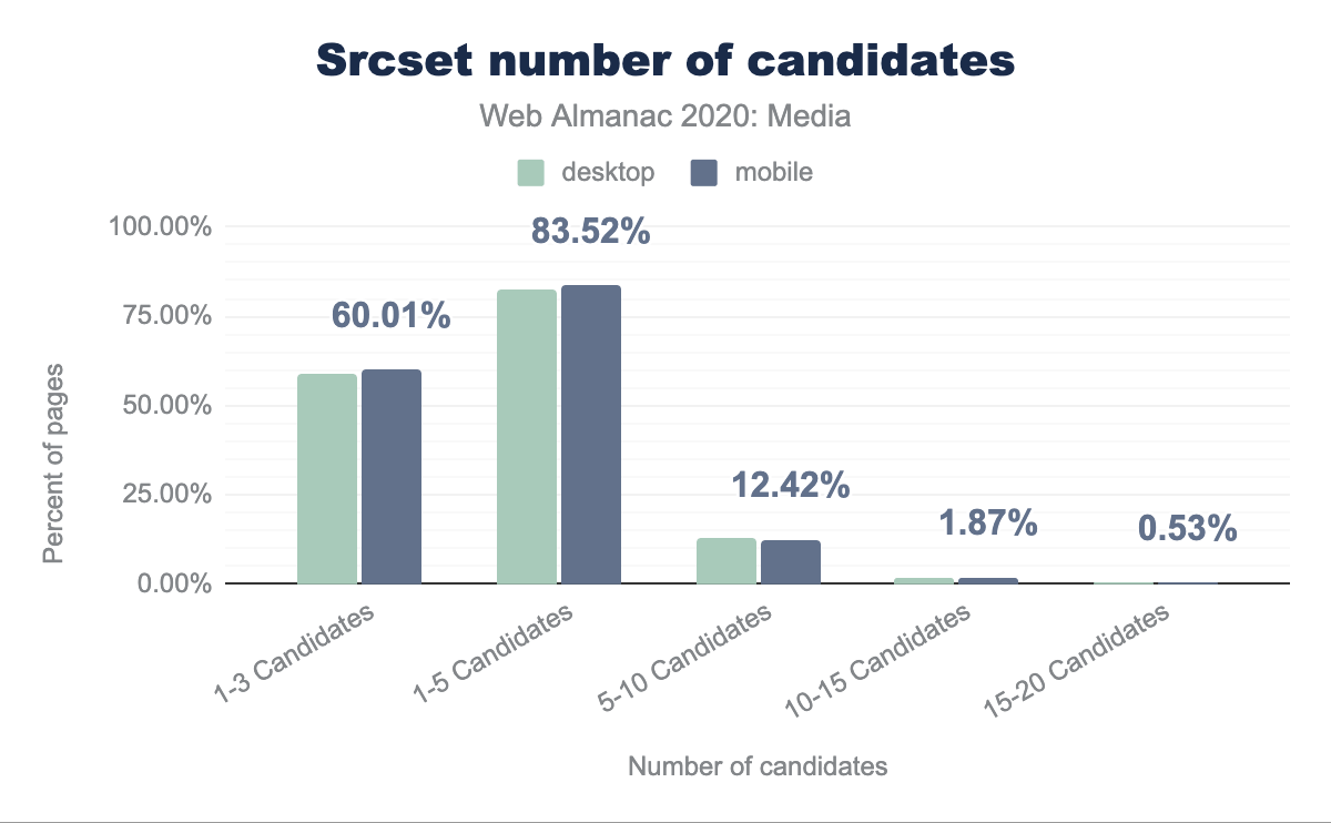
The fewer the number of image candidates, the greater the likelihood of the asset being cached, and if a CDN is being used, the greater the likelihood of it being available on a client’s nearest edge node. However the greater the difference in media dimensions, the more likely we are to end up serving media which is less-suited to the device and context in question.
Srcset: quantity of image candidates
In addition to the caching inefficiencies already mentioned, a greater number of dimensional variants will typically increase both the complexity of the media pipeline or service in use, and the required media storage.
When looking at this data, note that a few platforms (such as WordPress) use automated approaches which impact a large number of sites.
Srcset: descriptors
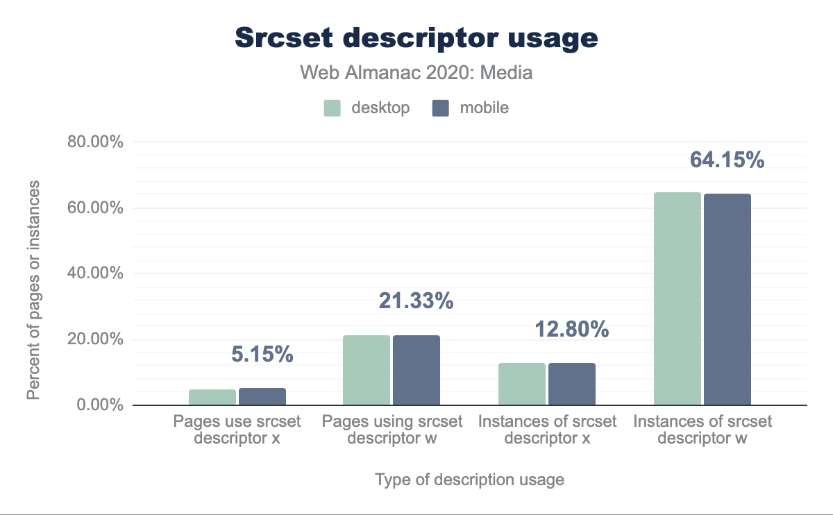
When providing the candidate list to the user agent, we have two mechanisms to annotate the candidate images: x descriptors and w descriptors.
x descriptors describe the device pixel ratio of the specific resource. For example a 2x descriptor would indicate that the specific image resource is of twice the dimensional size in each axis (containing four times as many pixels) and is suitable for devices with a window.devicePixelRatio of 2. Likewise, a 3x descriptor signifies nine times the number of pixels, which of course can have considerable payload implications.
<img srcset="images/example_3x.jpg 3x, images/example_2x.jpg 2x"
      src="images/example.jpg" alt="...">
w descriptors describe the candidate’s pixel width, along with a sizes attribute that is used to select the appropriate image.
<img srcset="images/example_small.jpg 600w, images/example_medium.jpg 1400w, images/example_large.jpg 2400w"
      sizes="100vw"
      src="images/example_fallback.jpg" alt="...">
Both approaches enable the user agent to mathematically factor in the current device pixel ratio when assessing the most appropriate image candidate.
In the early days of responsive images, some browsers only supported x descriptors, but clearly w descriptors are currently by far the most favored.
While it can be common to choose image candidates which are spaced by dimension (rendering every image at a set of pre-chosen widths, e.g. 720px, 1200px, and 1800px) there are also approaches to give more linear payload steps (e.g. a series of resources which are 50kb in difference). Tools like the Responsive Image Breakpoints Generator can be useful in facilitating this.
Sizes
Without the sizes attribute, the user agent will make its calculations based on a worst-case-scenario assumption that the image occupies the full width of the viewport. With it, browsers have more information about the image’s actual layout size and can make better choices.
For example:
<img sizes="(min-width: 640px) 50vw, 100vw"
      srcset="images/example_small.jpg 600w, images/example_medium.jpg 1400w, images/example_large.jpg 2400w"
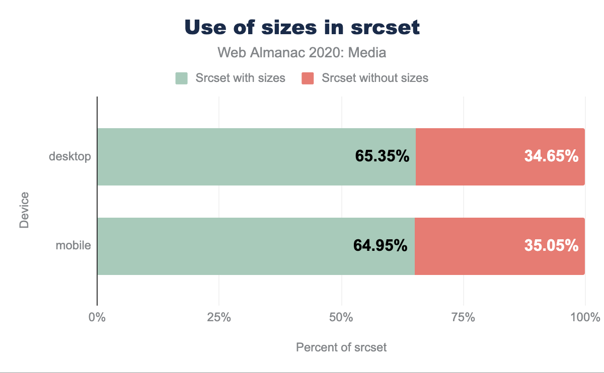
src="images/example_fallback.jpg" alt="...">For the 2020 data around 35% of sites using srcset did not also combine it with sizes. Though the browser will happily fall back to a sizes="100vw" default, leaving the attribute off is technically incorrect, and we regularly encounter instances where this oversight means that the mathematics to determine the most appropriate image candidate are flawed, often leading to unnecessarily-large images being requested.
Many people that we have discussed this with express that sizes is particularly tricky to implement in a correct, resilient fashion, due to the need to ensure cross-resource alignment between layout (as managed and determined by CSS) and responsive image markup (in HTML).
Picture
While srcset and sizes provide us with tooling to help provide browsers with images which are dimensionally more suited for a given viewport, device and layout - the <picture> element enables us to provide more sophisticated media strategies, including leveraging more effective image formats and empowering us to explore “art direction”.
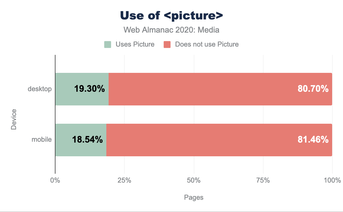
<picture> on desktop and 80.70% do not. On mobile it is similar with 18.54% using and 81.46% not using.<picture>.
Current uptake shows around 19% of pages being served using the <picture> element serving at least one image.
Picture: format switching
While there are some services and image CDNs which can provide auto-format switching from a single image URL using logic on the backend, we can also achieve similar behaviors using markup alone, with the <picture> element.
<picture>
    <source type="image/webp" srcset="images/example.webp">
    <img src="images/example.jpg" alt="...">
</picture>
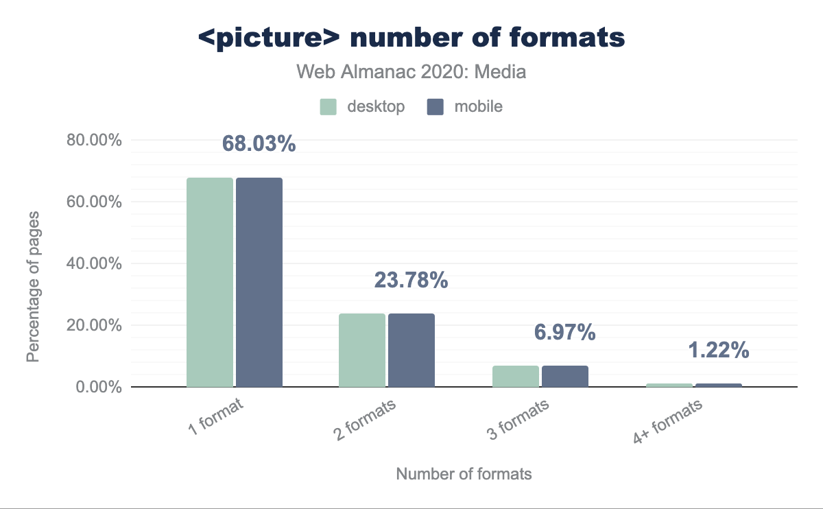
Breaking this down into the number of formats offered:
<picture> number of formats.
Of pages using <picture> for format-switching, around 68% are offering a single type variation, in addition to the <img src> which acts as the default.
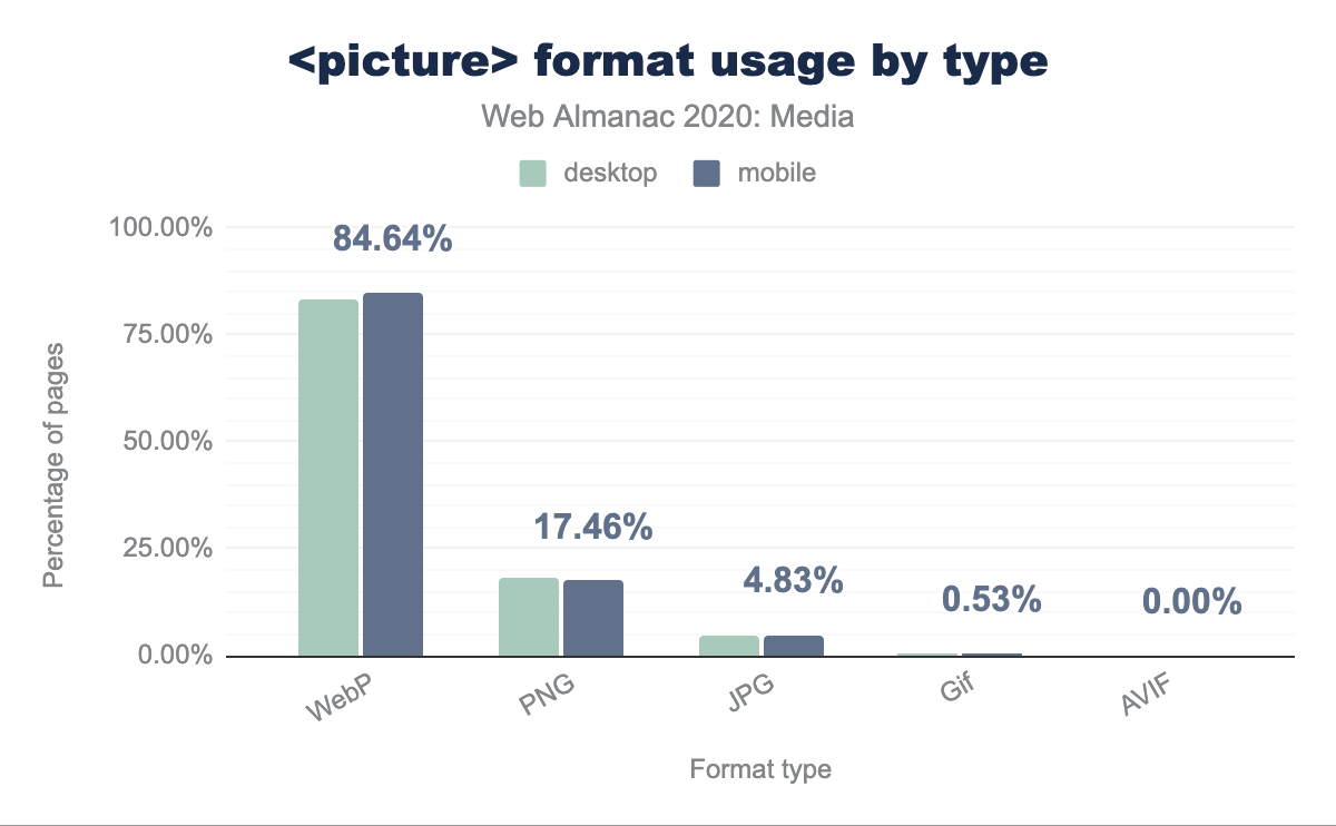
We see that WebP is the dominant usage across <source> elements, followed by PNG, and that and JPG is only 4.83% of <picture> usage.
Here is an example of the markup syntax that could be used to offer multiple format variants:
<picture>
  <source type="image/avif" srcset="images/example.avif">
  <source type="image/webp" srcset="images/example.webp">
  <source type="image/jp2" srcset="images/example.jp2">
  <source type="image/vnd.ms-photo"  srcset="images/example.jxr">
  <img src="images/example.jpg" alt="Description">
</picture>
The user agent will effectively select the first one that it has a positive match on, and hence the ordering here is important.
Of those pages using <picture> for format switching, 83% offer WebP as one of the format variants, which in part relates to its growing browser support.
Format support across browsers is a movable feast: WebP has now got much broader support.
- WebP: 90% coverage (Edge, Firefox, Chrome, Opera, Android)
- JPEG 2000: 18.5% coverage (Safari)
- JPEG XR: 1.7% coverage (IE)
- AVIF: 25% coverage (Chrome, Opera)
When constructing a set of fallback formats, authors must consider features, in addition to compression performance. For example, if an image contains transparency, a good “lowest-common denominator” to supply in the img src would be PNG. Then, one or more <source> elements containing next-generation formats that also support transparency – like WebP, JPEG 2000 and AVIF – could be used on top of that.
Similarly, consider stacking Animated WebPs or muted, looped, autoplaying MP4s on top of Animated GIFs (though mixing videos and images will have implications for the markup approach, and media processing needs).
There are three aspects to consider when implementing format-switching:
- The browser format support landscape
- A site’s media pipeline: the processes it uses to create the needed media in a variety of formats
- Implementing the markup to tell browsers which formats are on offer, and when to select each
Several Dynamic Media Services and Image CDNs can greatly simplify this by automating it and endeavoring to track and keep in sync with the ever-changing browser format support landscape.
Picture: media art direction
The media art direction capabilities offered by the <picture> element enable us to provide the kind of sophisticated viewport-dependent media manipulation that we have enjoyed when designing type and layouts for some time.
Consider how poorly landscape-oriented media with very wide-and-short aspect ratios (such as banners) works when squeezed into narrow, portrait-oriented mobile layouts. Adapting the crop or content of images based on media queries, is, in our opinion, an underutilized capability.
In this example, we are changing out the aspect ratio of the served media, from square (1:1) to 4:3 and eventually 16:9 depending on the viewport width, endeavoring to make the best use of the available space for our media:
<picture>
  <source media="(max-width: 780px)"
          srcset="image/example_square.jpg 1x, image/example_square_2x.jpg 2x">
  <source media="(max-width: 1400px)"
          srcset="image/example_4_3_aspect.jpg 1x, image/example_4_3_aspect_2x.jpg 2x">
  <source srcset="image/example_16_9_aspect.jpg 1x, image/example_16_9_aspect_2x.jpg 2x">
  <img src="image/example_fallback.jpg" alt="...">
</picture>
Picture: orientation switching
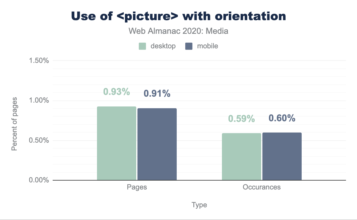
While the data shows that only a little under 1% of pages using <picture> make use of orientation, this feels like an area that warrants further exploration from website designers and developers.
<picture> with orientation. 0.59% of occurrences of <picture> on desktop and 0.60% on mobile use orientation.<picture> usage of orientation.
Mobile devices have small, constricted viewports, and are easy to turn from portrait to landscape mode in the hand. There is some interesting, underutilized potential for using the orientation media query.
Example syntax:
<picture>
  <source srcset="images/example_wide.jpg"
          media="(min-width: 960px) and (orientation: landscape)">
  <source srcset="images/example_tall.jpg"
          media="(min-width: 960px) and (orientation: portrait)">
  <img src="..." alt="...">
</picture>
Effective leveraging of image formats
Using the appropriate image format and the capabilities that format offers is critical to make effective use of media on web pages.
MIME types vs extensions
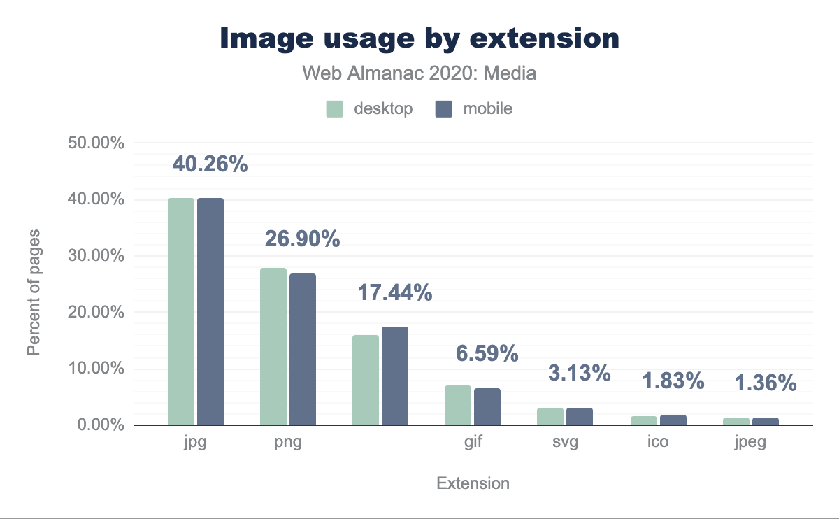
We observed a high distribution of extensions and various spellings of the same extension (e.g., jpg vs JPG vs jpeg vs JPEG). In some cases the MIME type is also specified incorrectly. For example - image/jpeg is the correct and recognized MIME type for JPEG images. However we can see that 0.02% of all the pages that use JPEG have specified the incorrect MIME type. Furthermore we can see that an extension of pnj was used 28,420 times (likely to be a typo) and its MIME time was set to image/jpeg.
jpg is the most used format at 40.26% of mobile, png is next with 26.90%, followed by no extension at 17.44%, gif at 6.59%, svg at 3.13%, ico at 1.83% and jpeg at 1.36%. Desktop is very similar usage.We have seen further inconsistencies between extensions and MIME types - for example .jpgs delivered with a MIME type of image/webp, however it is likely that some of these are natural artifacts caused by Image CDN delivery services with on-the-fly transformation and optimization capabilities.
Progressive JPEGs
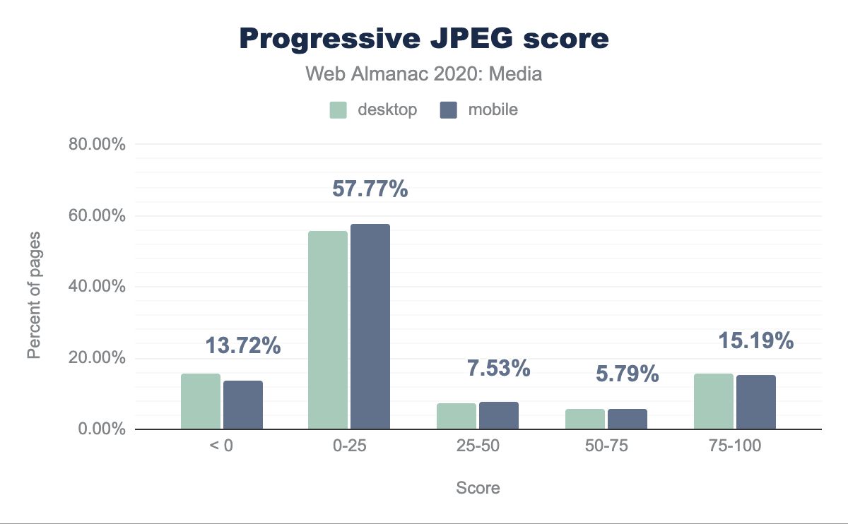
How common are progressive JPEGs? WebPageTest gives each page a “score,” which adds up all of the JPEG bytes that were loaded from progressively-encoded JPEGs and divides it by the total number of JPEG bytes that could have been progressively encoded. The majority (57%) of pages served less than 25% of their JPEG-bytes, progressively. This represents a large opportunity for no-downsides compression savings, that’s yet to be taken despite years of progressive JPEGs being a best practice and modern encoders like MozJPEG encoding progressively by default.
Microbrowsers
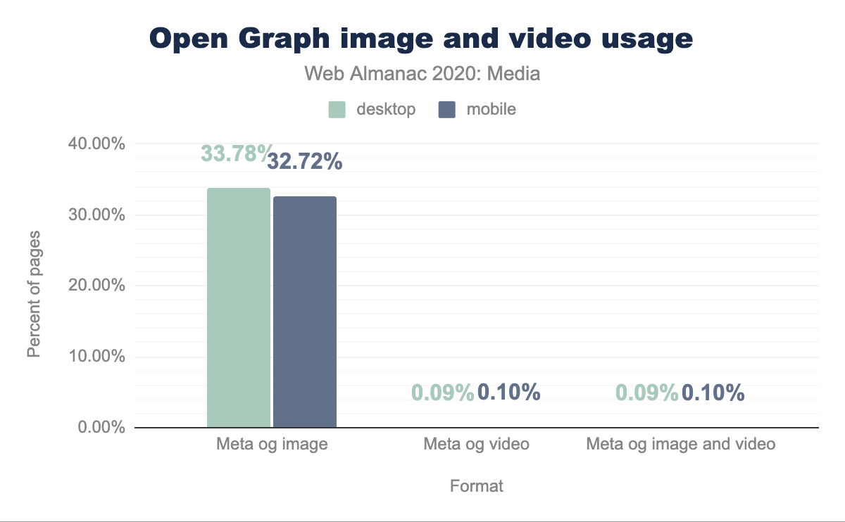
Let us turn now to the topic of microbrowsers. Also known as “link unfurlers” and “link expanders,” these are the user agents that request web pages and grab bits and pieces from them to assemble rich previews when links are shared in messaging or on social media. The lingua franca of microbrowsers is Facebook’s Open Graph protocol, so we looked at what percentage of web pages are including images and video specifically targeted towards microbrowsers in Open Graph <meta> tags.
A third of web pages include images, in Open Graph tags, for microbrowsers. But only around 0.1 percent of pages include microbrowser-specific videos; just about every page that included a video, also included an image.
A third of sampled web pages seems very healthy; the power of relational, word-of-mouth marketing combined with microbrowser-tailored rich previews is clearly worth investing in.
Given that video content is expensive to produce and much less common on the web than images, we understand the comparatively low usage. But the fact that videos are often playable and even autoplay-able from within the link previews themselves, without requiring a trip to a full-on browser, means that this is a big opportunity for boosting engagement.
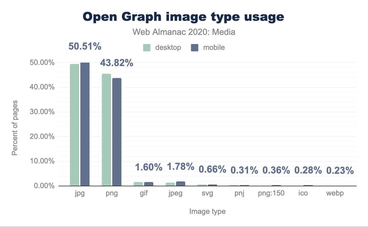
The Open Graph protocol only allows for one image or video URL to be included; there is none of the context-adaptive flexibility offered by <picture> and srcset. So, authors tend to be rather conservative when picking formats to send to microbrowsers. Fully half of all microbrowser-specific images are JPEGs; 45 percent are PNGs; a hair under 2 percent are GIFs. WebPs only account for 0.2% of images for microbrowsers.
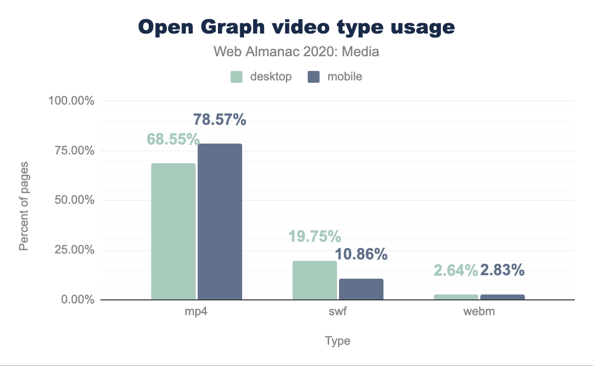
Likewise, on the video front, the vast majority of resources are sent in the lowest-common-denominator format: MP4. We are mystified as to why the second most popular format is the now-depreciated SWF, and curious whether these are playable in any microbrowser.
Usage of rel=preconnect
Media assets can be stored either locally, or on an Image CDN. The way assets are optimized, transformed and delivered to the end user highly depends on the appropriate technique used. When including images from another domain, the rel=preconnect attribute can be used on a <link> element to give browsers an opportunity to initiate DNS connections before they are needed. While this is a relatively cheap operation, there could be situations when the additional CPU time spent establishing such connections delays other work.
Analyzing the markup, on desktop we see 7.83% of pages using this, and on mobile it is 8.19%. The Resource Hints chapter used a slightly different methodology by analyzing the DOM and got similar, but slightly larger, numbers at 8.15% and 8.65% respectively.
Usage of data: URLs
Using data URLs (formerly known as data URIs) is a technique that allows developers to embed a base64-encoded image directly in HTML. This ensures that an image will be fully loaded by the time that the HTML has been parsed into a DOM tree, and virtually guarantees that the image will be available for the first paint. However, because they don’t compress over the wire as well as binaries, block other—possibly more important resources—from loading, and complicate caching, so base-64’d images are something of an anti-pattern.
The usage of these doesn’t seem to be that widespread: 9% of pages utilize data URLs for displaying images. However, it should be noted that we only investigated HTML-embedded base64 encoded image srcs and did not include CSS-embedded base-64-encoded images for background-images or the like.
SEO & Accessibility
Associating descriptive text with images not only helps accessibility for those who can’t view the images and utilize screen-readers, but it is also being used by various computer vision algorithms to understand the subject matter of an image. Descriptive text should be meaningful in the context of the page and relevant to the image it is describing. More information on these topics can be found in the SEO and Accessibility chapters.
Usage of alt text
The alt attribute for images is used to provide a description of the image. It is announced by screen-readers and is also shown in visual browsers when the image doesn’t load.
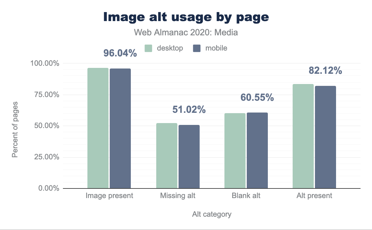
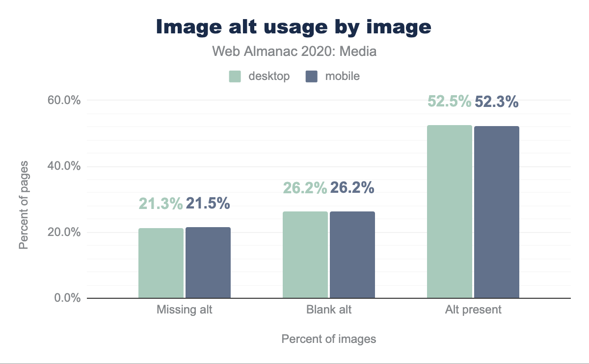
Around 96% of all the pages processed had an <img> element - 21% of these images were missing an alt attribute. 52% of the images had an alt attribute, however 26% of these were left blank. Put simply: only around a quarter of images on the web have a non-blank alt attribute; presumably even less than that have alt text that’s usefully descriptive.
Figure & Figcaption
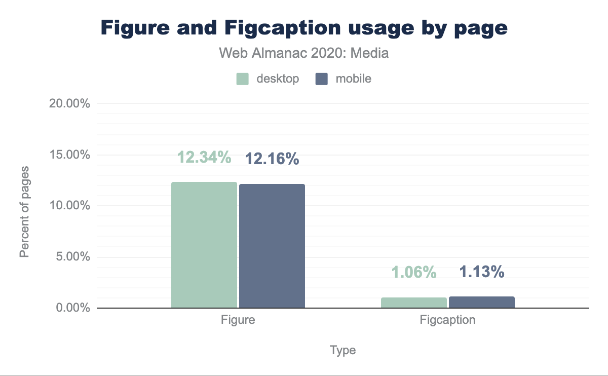
HTML5 added various new semantic elements to the language. One such element is <figure>, which can optionally contain a <figcaption> element as its child. Textual descriptions contained within <figcaption>s are semantically grouped with the other content of the <figure>.
We can see that roughly 12% of the pages on both desktop and mobile use the <figure> element, however only roughly 1% use <figcaption> to add a description.
Videos
If “a picture is worth a thousand words,” a minute of 30fps video must be worth 1.8 million!
Video is one of the most powerful ways to engage with an audience today, however adding video to a site is no small undertaking. There are a maze of formats and codecs to navigate, and myriad implementation details to consider. But the impact of video – both the visual impact, and the performance impact – cannot be overstated.
The <video> element
The <video> element forms the core of video delivery on the web and is used either on its own or in conjunction with JavaScript players which progressively enhance it to deliver video.
Sources (or not), and total usage
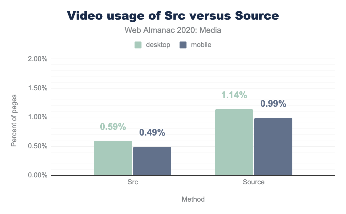
There are two ways to embed a video resource using the <video> element. You can either stick a single resource URL into the src attribute on the element itself or give it any number of child <source> elements, which the browser peruses until it finds a source it thinks it can load. Our first query looks at how often we see each of these patterns across all sampled pages.
Twice as many <video>s have <source> children, vs a src attribute. This indicates that authors want the ability to send different resources to different end users, depending on their context, rather than sending a single lowest-common-denominator resource to everyone (or, alternately, giving some portion of their audience a worse, or broken, experience).
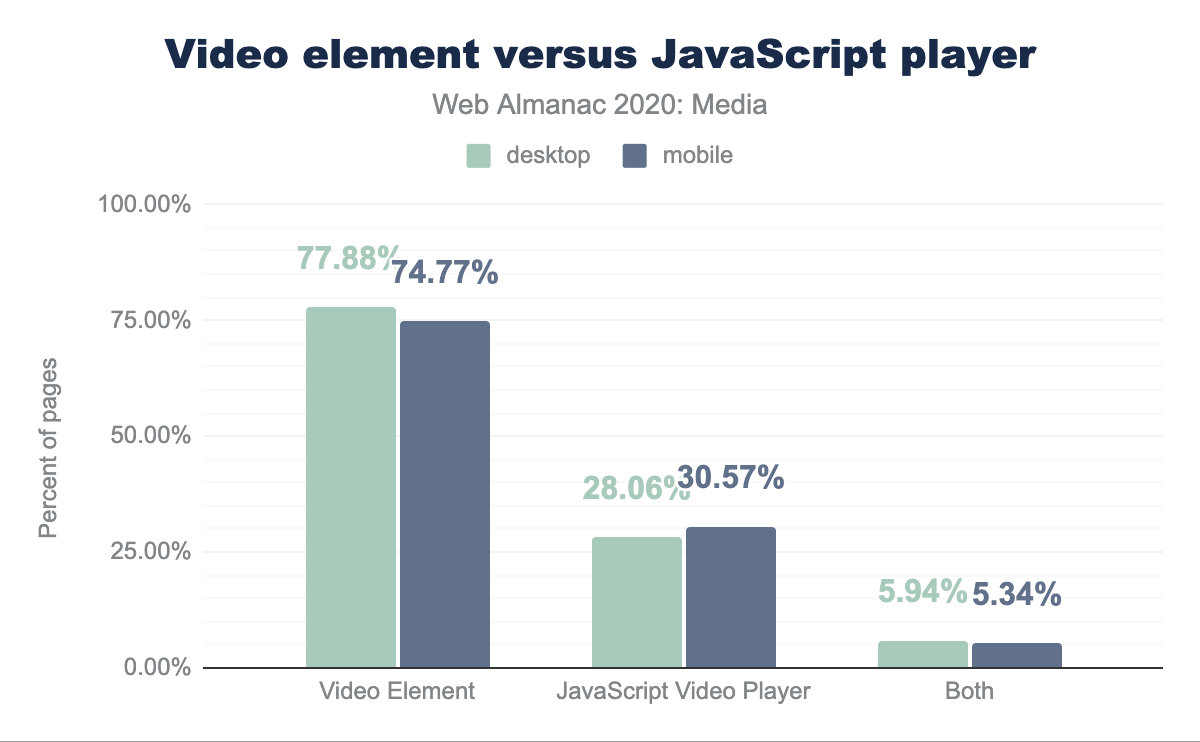
Also, interestingly, we can see that across all pages only a percent or two contain <video> elements at all. It is far less common than <img>!
JavaScript players
We looked for the presence of a few common players (hls.js, video.js, Shaka Player, JW Player, Brightcove Player, and Flowplayer). Pages with these particular players are less than half as common as pages that use the native <video> element.
The analysis is complicated a bit by the fact that many players – such as video.js – enhance in-source <video> elements. Only 5-6% of the pages that used the searched-for players also included a <video> element, but evidence of this pattern is actually more visible when we look at the values of type attributes, within <video> and <source> elements.
Type attributes
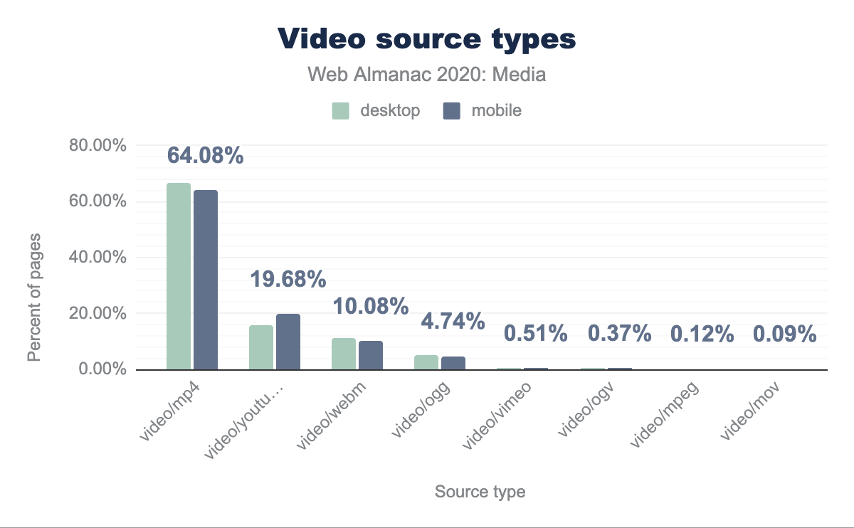
Unsurprisingly, by far the most common type value is video/mp4. But the second most common – making up 15% of all desktop types, and 20% of all types sent to the mobile crawler, is video/youtube – which is not a registered MIME type at all. Rather it is a special value that several players (including WordPress) use when embedding YouTube videos. A few notches down the list, we see a similar pattern, for Vimeo embeds.
As for the legitimate MIME types; they capture container formats; MP4 and WebM are the only two in anything we might call common use. It would be interesting to know which codecs are being used within these containers, and how much traction next-gen codecs like VP8, HVEC, and AV1 have gotten. But such analysis is, unfortunately, outside the scope of this article.
Video preload
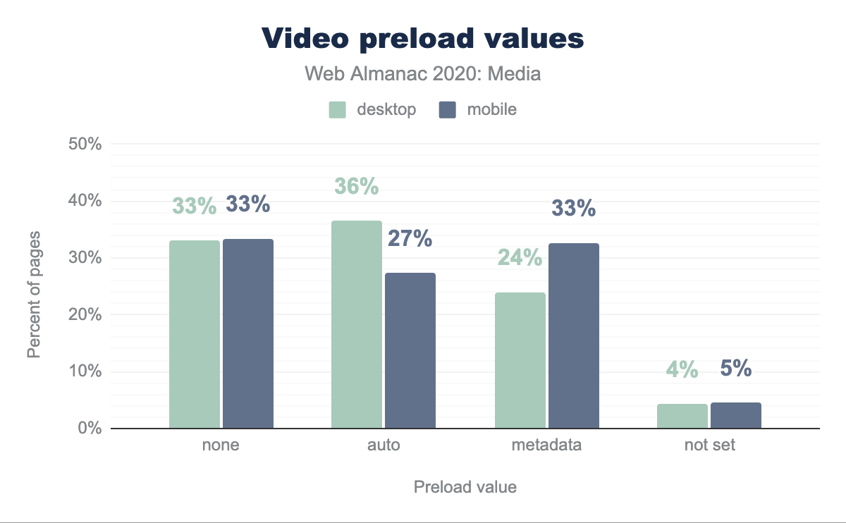
none, 36% of desktop and 27% of mobile pages with video have auto, 24% and 33% respectively have metadata, and 4% and 5% respectively do not have this set.The preload attribute indicates whether a video should be downloaded, and it can have three values: none, metadata, auto (note that if left empty, the auto value is assumed). We can see that 4.81% of pages have <video> elements, and 45.37% of these have the preload attribute. The numbers on mobile are slightly different, with only 3.59% of the pages having <video> elements and 43.38% of these having the preload attribute.
Autoplay and Muted
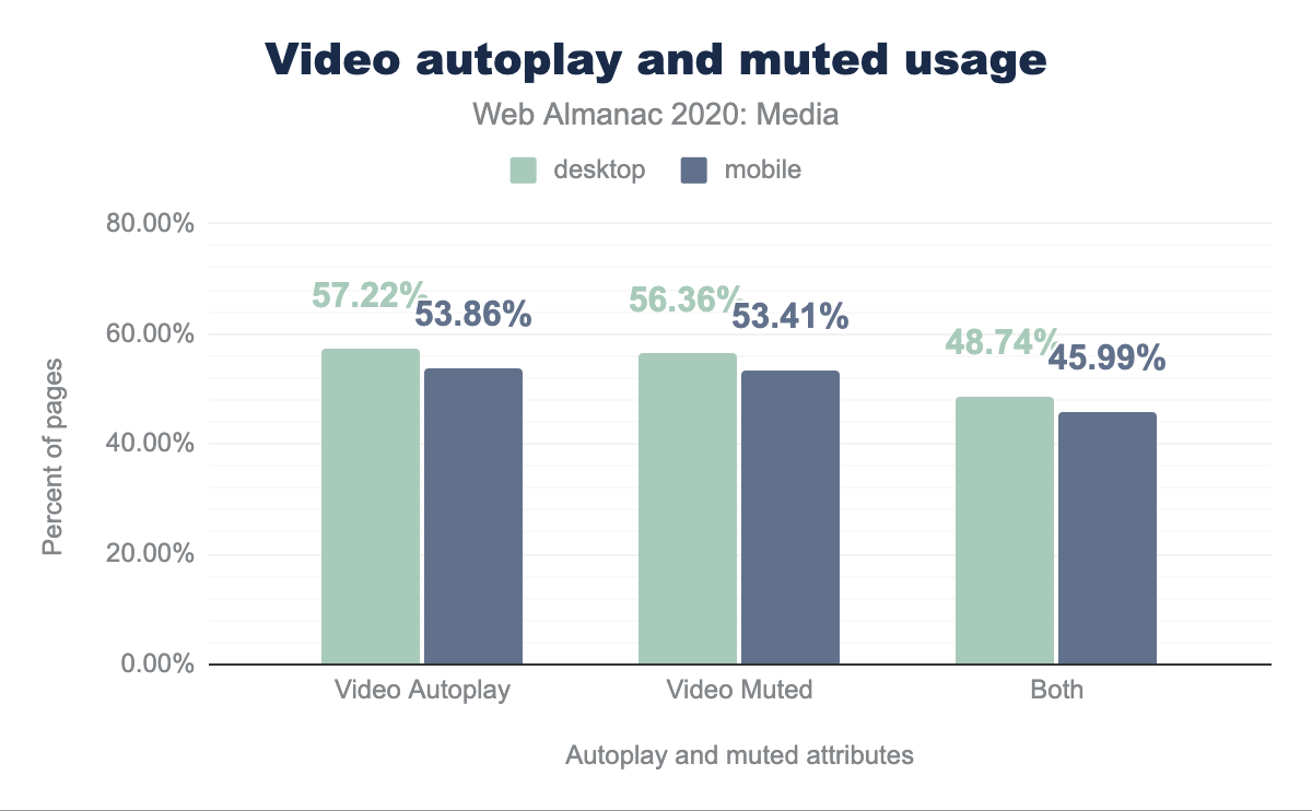
autoplay, 56.36% and 53.41% have muted, and 48.74% of desktop and 45.99% of mobile pages with video have both set.Looking at additional information about videos, we can see that 57.22% of the <video> elements on desktop have the autoplay attribute, 56.36% of pages with a <video> element on desktop utilize the muted attribute and last but not least 48.74% of pages use both autoplay and muted together, on desktop. The numbers are similar for mobile, where 53.86% have autoplay, 53.41% have muted and 45.99% include both attributes.
Conclusion
The web is an amazing place to tell a visual story. During our research we could see that the web is truly utilizing a lot of elements of media. This diversity is also shown in the number of ways media is represented on the web today. Most basic features for displaying media are being actively used, however using modern browsers we could do a lot more. Some of the advanced media features that are used today are amazing, however sometimes they are used incorrectly or in the wrong context. We would like to encourage everyone to go a level deeper: use all the features and capabilities of the modern web to bring more amazing visual experiences to users.
